The Grocery Store Layout Trick That Makes Shoppers Buy More Food
Most shoppers assume grocery stores are arranged simply to make products easy to find. In reality, the layout is carefully engineered to guide how customers move, what they notice, and ultimately what they buy. From the moment someone walks through the entrance, subtle design choices begin influencing their behavior. Product placement, aisle direction, and visual displays all work together to expose shoppers to more items than they originally intended to purchase. Over time, these strategies increase the number of products customers place in their carts. Bright packaging and signage are designed to stop shoppers as they pass by.
The Psychology Behind Grocery Store Layouts
Walk into a grocery store, and it may appear like a simple arrangement of shelves and aisles, but the layout is carefully designed to influence how people shop. Retailers rely heavily on behavioral research to understand how customers move through a store and what encourages them to place extra items in their carts. The goal is not just to help shoppers find what they need but also to expose them to products they did not originally plan to buy. Every shelf placement, aisle width, and product display is intentionally organized to shape purchasing behavior. Store planners carefully study how lighting, colors, and product grouping affect a shopper’s attention span.
Retail designers study how shoppers naturally move through spaces. Most customers tend to turn right when entering a store and follow a path that circles the perimeter. Grocery stores use this predictable behavior to place appealing displays and popular items along that route. This strategy increases the number of products customers see before they reach the items they initially came to buy. The longer shoppers remain in the store and the more products they encounter, the higher the chances they will make unplanned purchases. These insights help determine where promotional items should be placed for maximum visibility.
Psychology also plays a role in how comfortable shoppers feel while browsing. Wide aisles, bright lighting, and organized displays make the shopping experience feel relaxed and inviting. When people feel comfortable in a store environment, they tend to spend more time exploring different sections. That additional time naturally leads to greater exposure to products, which often results in larger baskets by the time customers reach the checkout. A pleasant atmosphere also reduces the sense of urgency that might otherwise rush shoppers through the store. When the environment feels calm and inviting, browsing becomes part of the experience rather than a quick task.
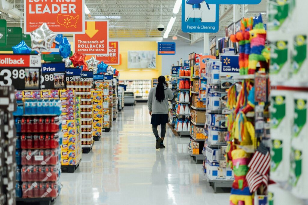
The Racetrack Layout That Guides Shoppers Through the Store
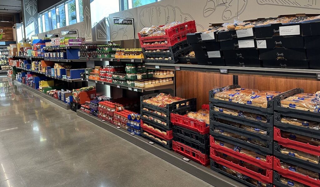
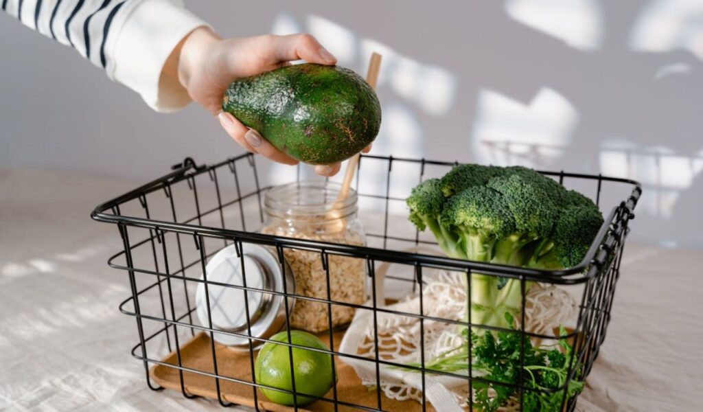
One of the most common grocery store designs is known as the racetrack layout. This format encourages customers to follow a circular path that runs around the outer edges of the store before moving into the inner aisles. Fresh produce, bakery items, and prepared foods are typically placed along this perimeter. These visually appealing sections create a strong first impression and encourage shoppers to continue exploring the store. The bright colors of fruits and vegetables often serve as a visual welcome when customers enter the space. This approach creates a sense of freshness and quality before shoppers even begin their main shopping journey.
By guiding customers along a predictable route, stores ensure that shoppers pass by many product categories even if they only intended to buy a few items. This layout exposes customers to more choices and often sparks spontaneous purchases. For example, a shopper entering the store to buy milk might walk past fresh pastries, ready-made meals, and seasonal fruit displays before reaching the dairy section. Each of these sections creates another opportunity for an unexpected purchase. The layout essentially transforms a simple shopping trip into a gradual discovery of different food options. Retail planners often refer to this as guided circulation.
The racetrack design also encourages browsing rather than quick in-and-out trips. Stores intentionally create visual interest along the perimeter to slow shoppers down. Colorful produce displays, the smell of fresh bread, and open refrigeration cases all attract attention. These sensory cues encourage customers to pause and consider items they might not have originally planned to buy. Even subtle details such as background music and lighting levels contribute to this slower pace. Retailers understand that the more relaxed the browsing experience feels, the more likely customers are to explore additional sections.
The Essential Items Placed at the Back
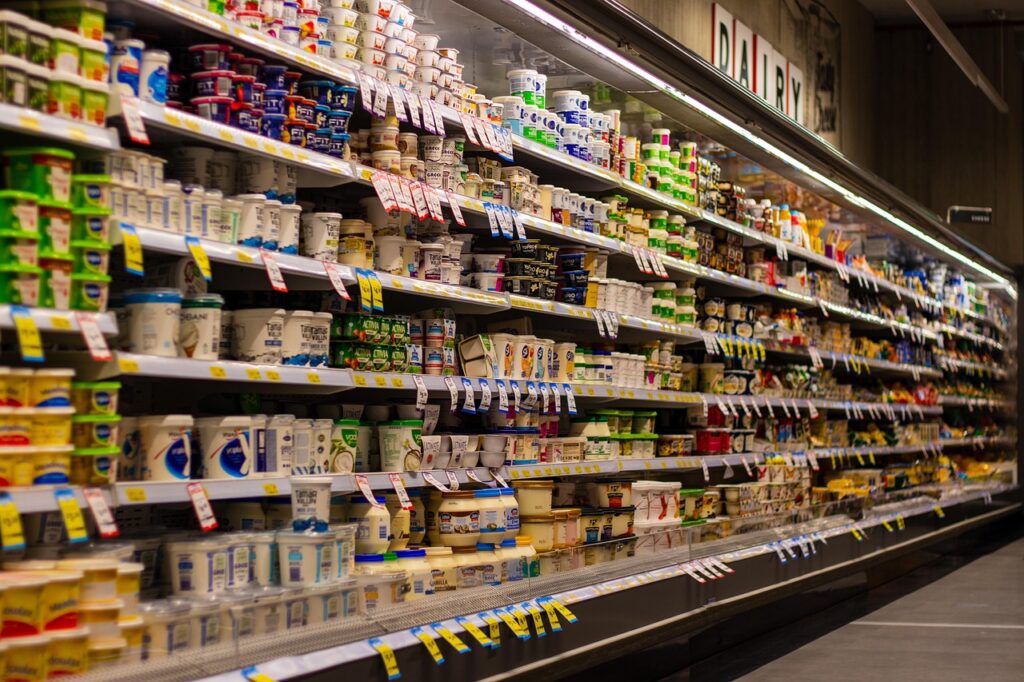
Many shoppers notice that staple items such as milk, eggs, and bread are often located toward the back of a grocery store. This placement is rarely accidental. Retailers intentionally position these high-demand products deep inside the store so that customers must walk through multiple aisles to reach them. This path increases the likelihood that shoppers will notice items they had not originally considered purchasing. Over time, repeated exposure to these products helps create familiarity with different brands. Placing staples far from the entrance also prevents crowding near the front of the store.
The strategy increases the likelihood of impulse purchases. A shopper who walks past snack aisles, frozen foods, and promotional displays may decide to add an extra item or two before reaching the dairy section. Even small additions to many shopping carts can significantly increase overall sales for the store. These extra purchases often happen almost automatically during a typical shopping trip. Many shoppers do not realize how frequently these spontaneous choices occur. Impulse purchases often happen when shoppers see products they forgot they needed. The longer walking path increases the chances of these reminders.
This layout strategy also ensures that customers travel through multiple sections of the store rather than heading directly to a single product and leaving. By encouraging movement through different areas, grocery stores increase product visibility. Over time, this repeated exposure helps build familiarity with brands and encourages customers to try new items. Familiarity often creates a sense of trust toward certain products. When shoppers recognize an item from previous visits, they may feel more comfortable purchasing it. Over time, shoppers begin associating these items with their routine grocery trips.
The Power of Endcap Displays
Endcap displays are the shelves located at the ends of aisles, and they are among the most valuable spaces in a grocery store. Because shoppers naturally walk past these areas when moving between aisles, products placed on endcaps receive far more attention than items located deeper within shelves. Retailers use this visibility to promote special deals or highlight new products. A well-designed endcap display can quickly attract attention from across the aisle. This makes it easier for shoppers to notice promotional items without actively searching for them. Because of their location, these displays naturally become focal points in the shopping path.
Many endcap displays feature seasonal items, promotional pricing, or bundled products designed to encourage quick decisions. The display often uses bold colors, large price signs, and neatly stacked products to catch the shopper’s eye. Even customers who are not specifically looking for the item may be tempted by the display because of its prominent position. Attractive signage also reinforces the perception of value for the featured products. These displays often change frequently to keep the shopping environment visually engaging. Shoppers begin to expect something new each time they pass the aisle.
Manufacturers sometimes pay retailers for the opportunity to place their products on endcaps because of the increased exposure. The strategic placement can dramatically increase sales for certain items. This makes endcaps one of the most effective marketing tools within a physical grocery store. Retailers carefully evaluate which products deserve these spaces based on demand and promotional goals. Because of their visibility, these displays play a significant role in shaping purchasing patterns. A successful endcap can influence hundreds of shoppers in a single day. Shoppers encounter these displays immediately as they enter new aisles.
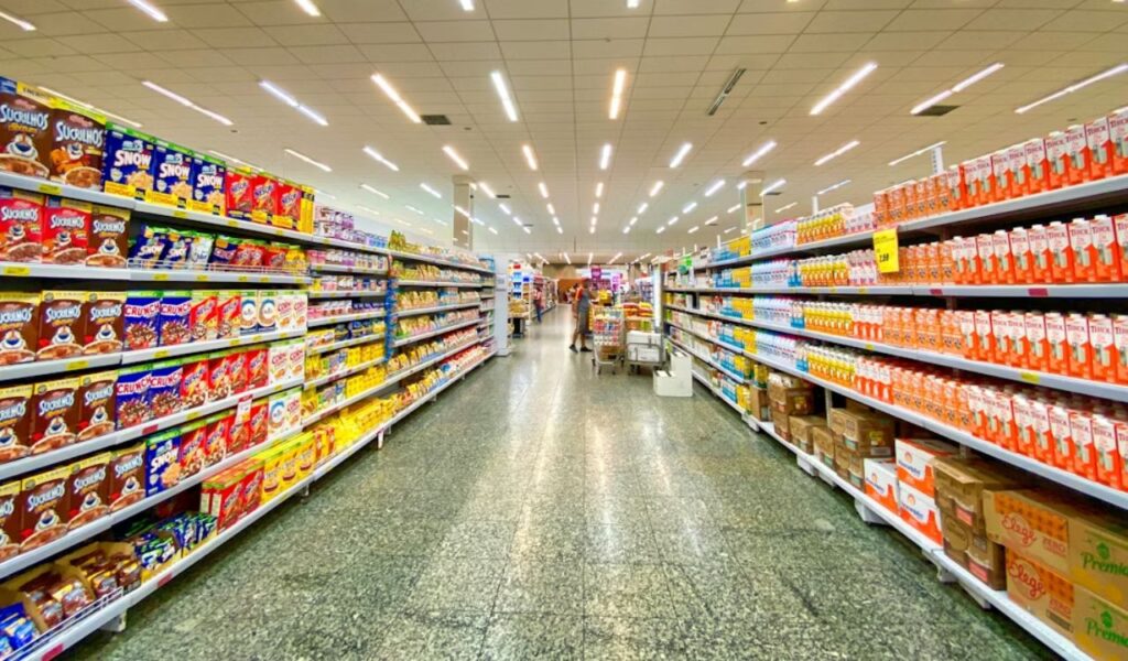
Eye Level Placement and Shelf Psychology
The arrangement of products on grocery store shelves follows a deliberate hierarchy. Items placed at eye level are often the products retailers want shoppers to notice first. These may include higher-priced brands or items that generate greater profit margins for the store. Because customers naturally focus on what is directly in front of them, eye-level placement becomes valuable retail space. Retail planners consider this area prime territory for featured products. Shoppers often reach for these items without scanning the entire shelf. This placement quietly influences which products receive the most attention.
Products intended for children are often placed on lower shelves where they are easily visible from a child’s perspective. Bright packaging and recognizable characters are used to attract attention and encourage requests from younger shoppers. This placement strategy influences purchasing decisions in subtle but effective ways. Children often point out items that catch their eye during a shopping trip. These requests can quickly turn into additional purchases. Packaging designers intentionally create visuals that appeal strongly to young shoppers. Animated mascots and colorful fonts make products feel playful and exciting.
Meanwhile, budget brands and bulk items may appear on higher or lower shelves that receive less immediate attention. Shoppers who are actively comparing prices may still seek them out, but casual browsers are more likely to choose products positioned at eye level. This arrangement quietly guides purchasing choices without requiring any active persuasion. Many shoppers are unaware that shelf placement influences their decisions. The structure of the shelf subtly encourages certain choices over others. Over time, these small nudges shape long-term shopping habits. Premium brands benefit most from this positioning advantage.
Checkout Lanes Built for Last Minute Purchases
The checkout area is one of the most strategically designed sections of a grocery store. While customers wait in line, they are surrounded by small, inexpensive items placed within easy reach. Candy bars, gum, snack packs, and small beverages are common choices for this space. These items are selected because they are easy to add to a purchase without much thought. Their compact size allows them to fit neatly into already full carts. This convenience makes them ideal impulse purchases. Shoppers can quickly grab them without disrupting the checkout process. Their low price reduces hesitation during the final moments of shopping.
Waiting in line creates a moment of idle browsing. Customers may glance at nearby products simply to pass the time. Retailers use this pause to encourage impulse purchases by offering items that require little decision-making. Because these products are inexpensive, shoppers often add them to their cart without hesitation. The placement of these items is carefully planned to maximize visibility. Even a glance can spark interest in a nearby product. Retailers analyze which items sell best in these spaces and adjust displays accordingly. High-turnover products are rotated frequently to maintain interest.
This strategy works especially well for shoppers with children. Brightly colored packaging and recognizable treats attract attention quickly. A small request from a child can easily turn into an extra purchase at the register. Over thousands of transactions each day, these small additions contribute significantly to store revenue. Retailers rely on these impulse items to boost overall sales. Even minor purchases can accumulate into substantial daily profits. This is why checkout shelves remain packed with tempting items. These displays often change based on seasonal demand. Limited-time packaging increases urgency.
The Decompression Zone at the Store Entrance
The area just inside the entrance of a grocery store is known as the decompression zone. This space allows shoppers to adjust to the environment after entering from outside. During these first few moments, customers are not yet fully focused on product displays. Retail designers understand this behavior and avoid placing important promotions directly at the entrance. Instead, the area provides a transition between the outside world and the shopping environment. This brief adjustment period helps shoppers settle into the store’s atmosphere. It also prevents sensory overload at the moment of entry.
Instead, the decompression zone is often kept relatively open with minimal product placement. This allows shoppers to orient themselves and become comfortable in the space. Once they move beyond this area, they begin paying closer attention to shelves and displays. The open layout also prevents congestion near the entrance. Shoppers can easily grab carts or baskets before continuing deeper into the store. This smooth entry improves the overall shopping experience. Clear signage is often placed nearby to guide customers toward major departments. Lighting in this area tends to be bright and welcoming.
By giving customers a moment to adjust, stores ensure that the next sections they encounter receive more focused attention. Fresh produce or bakery displays often appear immediately after the decompression zone because they are visually appealing and help establish a positive impression of the store. These areas signal freshness and quality to customers early in the visit. The placement helps create a welcoming and inviting first impression. Strong first impressions often shape how shoppers perceive the rest of the store. Colorful fruits, vegetables, and baked goods create a sense of abundance. Pleasant aromas from bakery sections can also influence mood.
How Store Layout Increases Basket Size
Ultimately, the purpose of these layout strategies is to increase the total number of items shoppers purchase. By guiding customers through multiple sections and exposing them to appealing displays, grocery stores create more opportunities for unplanned purchases. Each additional item added to a cart contributes to the overall effectiveness of the store design. Retailers carefully measure how layout changes affect customer spending patterns. These insights help refine store design over time. Even small layout adjustments can lead to noticeable changes in average spending. Data from loyalty programs and sales tracking support these evaluations.
The layout also encourages shoppers to spend more time inside the store. The longer people remain in the shopping environment, the more likely they are to discover products they had not initially planned to buy. Even a few extra minutes of browsing can lead to additional purchases. Many shoppers enjoy exploring new products or seasonal offerings during this time. These discoveries often turn into repeat purchases on future visits. Exploration adds an element of enjoyment to the shopping trip. Attractive displays can spark curiosity about unfamiliar brands. Seasonal decorations and limited-time products encourage closer inspection.
These strategies do not force shoppers to buy anything they do not want. Instead, they rely on subtle psychological cues and thoughtful design to encourage exploration. Over time, these techniques have become standard practice in retail environments because they consistently increase sales while maintaining a pleasant shopping experience. Retailers aim to balance profitability with customer satisfaction. A well-designed store layout helps achieve both goals simultaneously. Successful layouts encourage spending while still feeling natural to shoppers. Customers feel guided rather than pressured. This subtle influence helps maintain trust while still supporting sales.