Why Grocery Store Layouts Feel Designed to Make You Overspend
A trip to the grocery store feels routine, even ordinary. Yet behind every aisle, display, and checkout lane lies careful planning. Store layouts are not random. They are shaped by psychology, data, and retail strategy designed to increase time spent browsing and, ultimately, total spending. From the placement of milk at the back to tempting displays near checkout, every detail influences behavior. Understanding how these environments guide decisions can help shoppers recognize subtle cues and take greater control of their budgets.
The Psychology Behind Store Design
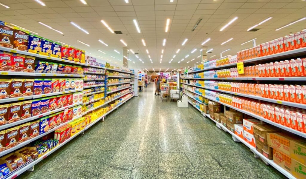
Walk into most supermarkets and the layout rarely feels accidental. Store design relies heavily on behavioral psychology, particularly how people move, scan shelves, and make quick decisions. Research shows that shoppers tend to turn right upon entering, so high-margin items are often placed in that direction. Wide aisles at the entrance create a relaxed pace, encouraging customers to slow down and settle into browsing rather than rushing through a list. The physical space is arranged to subtly shape attention and movement. This approach increases exposure to profitable categories early in the visit.
Beyond movement patterns, stores are structured to keep shoppers inside longer. The longer someone remains in the store, the higher the likelihood of unplanned purchases. Essential items such as milk, eggs, and bread are often placed at the back, so customers must pass multiple categories to reach them. Along the way, exposure increases temptation. Every additional visual cue raises the chance of adding something extra to the cart. This layout ensures repeated contact with high-margin goods. Even routine trips become opportunities for discovery. Time spent inside often translates directly into higher totals.
Lighting, shelf height, and product placement also play psychological roles. Products placed at eye level often generate the most sales because they are easiest to notice. Lower shelves may hold store brands, while premium or profitable brands sit within comfortable reach. These decisions are deliberate and data-driven. Store design becomes a quiet conversation between psychology and profit strategy. Softer lighting in certain sections encourages slower browsing. Strategic color use draws attention to promotions. Even background music can influence pace and mood. Slower tempo music often leads shoppers to move more gradually through aisles.
Why Stores Rearrange Aisles Regularly
If it feels like favorite items keep moving, that feeling is not accidental. Grocery stores periodically rearrange aisles to disrupt shopping routines and encourage exploration. When shoppers cannot rely on memory alone, they must search for items. That search increases exposure to other products that might not have been considered otherwise. The longer someone looks, the more likely they are to notice something new. This interruption reduces automatic behavior. It forces renewed attention on shelf contents. Increased scanning often leads to added purchases. Habit disruption increases cognitive engagement with the environment.
Rearranging layouts also prevents shoppers from becoming too efficient. A predictable route minimizes browsing, which can limit impulse spending. By changing the locations of staples or shifting entire categories, stores create mild friction. That friction forces attention and slows down the trip. Even small layout tweaks can lead to measurable changes in purchasing behavior. Familiar pathways become less reliable. Shoppers pause more frequently to reorient themselves. That pause creates an opportunity for suggestion. Retail studies show that even minor confusion increases aisle exposure. Increased aisle exposure correlates with higher average spending.
These shifts also reflect seasonal strategies and supplier agreements. When brands pay for better placement, categories may be adjusted to accommodate new displays. Stores balance customer familiarity with strategic disruption. The goal is not confusion, but controlled rediscovery. Every rearrangement resets shopping patterns in subtle but profitable ways. Seasonal resets refresh visual interest. New layouts highlight promotional campaigns. The store feels updated without changing its core structure. Rearrangement also creates a sense of novelty. Novelty increases attention, which directly influences buying decisions.
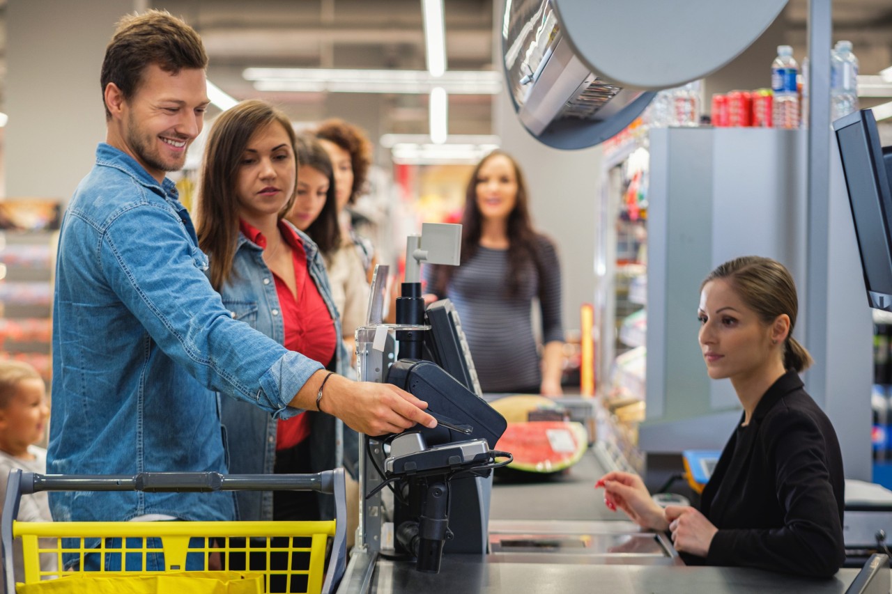
Impulse Buys and Checkout Placement
The checkout lane is one of the most engineered zones in any grocery store. By the time shoppers reach this point, decision fatigue often sets in. After navigating aisles and comparing products, mental energy is lower. Small, colorful, inexpensive items placed near the register are designed to capitalize on that fatigue. Candy, magazines, batteries, and seasonal treats become easy additions. These items require little deliberation. Their low cost reduces hesitation. The proximity to payment increases conversion. Decision fatigue weakens resistance to small temptations. That psychological state makes last-minute purchases more likely.
These products are typically low-cost but high-margin. Because they feel minor compared to the total bill, shoppers are less likely to resist them. Children’s eye-level placement of sweets further increases demand, especially in family households. The strategy relies on emotional impulse rather than planned necessity. It turns waiting time into spending time. Packaging is often bright and attention-grabbing. Placement aligns with hand reach zones. Visual repetition reinforces desire. Even short waiting periods can result in additional spending. Retail data consistently shows measurable revenue increases from these carefully positioned impulse items.
Checkout layouts are also carefully spaced to prolong exposure. Long queue lines snake past racks of snacks and novelty items. Even self-checkout areas feature strategic displays. Every square foot near the register is optimized for visibility and temptation. What appears to be convenience is often a carefully calibrated opportunity. The final moments of the trip are monetized. Small add-ons accumulate quickly. The register becomes a final sales checkpoint. Studies show that impulse purchases near checkout significantly increase overall store revenue. The area functions as a last chance influence zone before payment is finalized.
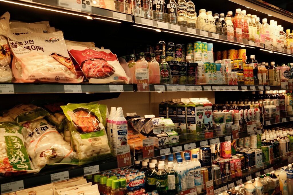
Most grocery stores follow a predictable pattern, even if it is not immediately obvious. Fresh produce often greets shoppers at the entrance, creating an impression of health and abundance. This sets a positive tone and may reduce guilt later when less healthy items are added. The store perimeter usually houses fresh departments such as bakery, dairy, and meat. Inner aisles contain packaged and processed goods. The structure feels intuitive. It guides shoppers without obvious instructions. Movement becomes almost automatic. The predictable layout builds subconscious comfort. Comfort encourages longer stays and more relaxed browsing.
This layout encourages a loop around the store before cutting inward. By guiding traffic along the perimeter first, shoppers encounter high-margin fresh items before moving toward the center aisles. The path feels natural, but it is strategically designed. Traffic flow studies influence aisle width and shelf orientation to avoid congestion while maximizing exposure. Wider outer paths accommodate carts easily. Narrower inner aisles slow browsing slightly. Flow design balances comfort with exposure. The perimeter strategy ensures that essential departments are always encountered. That encounter increases cross-category sales opportunities.
Navigation cues such as signage and aisle numbering also affect movement. Clear signage gives a sense of control, but it still directs shoppers past promotional zones. Strategic placement ensures that popular categories anchor specific sections. The store becomes a structured environment that subtly shapes purchasing patterns through guided navigation. Directional arrows sometimes guide foot traffic. Lighting highlights focal categories. Wayfinding reduces frustration while preserving exposure. Organized navigation creates confidence in shoppers. Confident shoppers are more likely to explore additional categories.
The Influence of End Caps and Displays

End caps are some of the most valuable real estate in a grocery store. Positioned at the end of aisles, they capture attention immediately as shoppers turn corners. Products placed here often experience higher sales simply due to increased visibility. These displays frequently feature promotional items or brands that have paid for premium positioning. Their placement interrupts standard scanning behavior. The sudden visibility creates novelty. That novelty increases recall. High-traffic intersections amplify this effect. Products on end caps benefit from repeated exposure as shoppers pass multiple times.
Because end caps interrupt routine scanning patterns, they create a moment of pause. Shoppers may not have planned to buy the item displayed, but the prominent placement increases curiosity. Seasonal products often dominate these areas, tying into holidays or limited-time themes. The sense of urgency adds psychological pressure to act quickly. Bright signage amplifies perceived value. Bulk stacking signals popularity. Limited-time messaging increases impulse response. Urgency-based messaging reduces comparison shopping. The combination of placement and messaging shortens the decision-making process significantly.
Display design also matters. Bright signage, bulk stacks, and perceived discounts amplify appeal. Even when discounts are modest, presentation can create a sense of value. End caps function as silent advertisements within the store. They blend visual impact with strategic positioning to drive incremental sales. Strategic lighting highlights key items. Signage often uses bold typography. Placement reinforces promotional narratives. Visual symmetry draws the eye naturally. Repetition of brand colors strengthens recognition and recall. Strong visual framing helps products stand out in crowded retail environments.
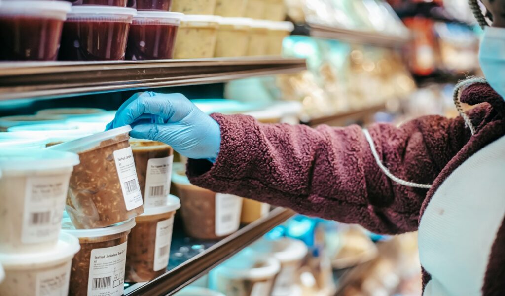
Fresh Food Zones as Anchors
The produce section serves as more than a place to buy fruits and vegetables. It acts as an emotional anchor for the entire shopping experience. Vibrant colors, misted greens, and open displays create a sense of freshness and quality. This atmosphere builds trust and encourages a perception that the store prioritizes health. Visual abundance signals variety. Natural scents enhance authenticity. The display communicates quality before pricing is considered. Fresh presentation sets expectations for the rest of the store. This early perception shapes how shoppers evaluate prices later in the trip.
Fresh zones are typically placed near entrances to influence first impressions. Research suggests that beginning with healthy purchases can create a licensing effect, where shoppers feel justified in adding indulgent items later. The layout leverages that behavioral pattern. A cart filled with fresh produce can reduce hesitation toward less essential purchases. Early healthy choices create emotional balance. That balance influences later decisions. Behavioral studies support this sequential influence. Early virtuous choices often lead to later indulgent decisions. The order of exposure plays a measurable role in total basket composition.
These sections also encourage slower browsing. Open bins and tactile displays invite interaction. Unlike packaged goods, fresh items require inspection. This engagement increases time spent in the store, which correlates with higher spending. The freshness narrative sets the stage for the rest of the trip. Longer browsing increases exposure. Exposure increases basket size. The anchor effect reinforces store trust. Trust increases willingness to try new products. That willingness expands purchasing beyond planned items. Sensory engagement strengthens emotional connection to the store environment.
Pricing Signs and Shopper Perception
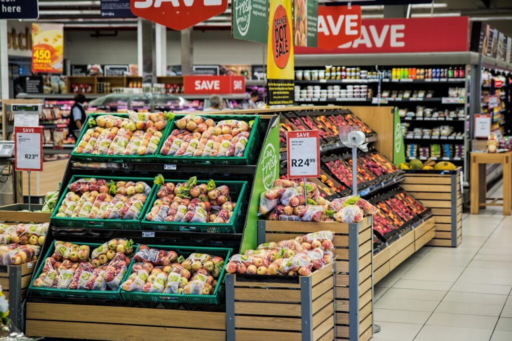
Pricing strategies extend beyond the number printed on a tag. Stores use visual cues such as bold colors, larger fonts, and phrases like “limited time” to create urgency. Even small design differences can influence perception of value. A bright sign may suggest a significant discount, even if the price reduction is modest. Red signage often signals savings. Contrast improves visibility. Repetition reinforces deal awareness. Color psychology influences the interpretation of discounts. Visual framing can alter perceived price fairness. The way a price is presented often matters as much as the price itself.
Placement also shapes perception. Sale items often appear at eye level or in high-traffic areas. Bundled pricing, such as “$2 for $5” encourages purchasing multiples, even when buying one is allowed. This framing increases overall basket size without dramatically lowering individual item cost. Multi-buy signage suggests better value. Quantity framing alters decision-making. Shoppers respond to perceived savings cues. Bulk framing shifts attention from unit price to total perceived benefit. That shift often increases spending unintentionally. Framing influences whether shoppers think in terms of savings or total cost.
Psychological pricing tactics such as ending prices in .99 continue to influence buying behavior. These methods exploit cognitive shortcuts that interpret lower trailing digits as better deals. Clear, bold signage can override careful comparison. Pricing design becomes another subtle tool that steers spending decisions. Perception often outweighs calculation. Visual emphasis drives quick judgment. Subtle cues influence final totals. Consumers rarely calculate precise percentage savings. Instead, they rely on visual impressions to guide decisions. These small pricing cues accumulate into meaningful spending differences over time.
Smart Shopping Tactics to Avoid Overspending

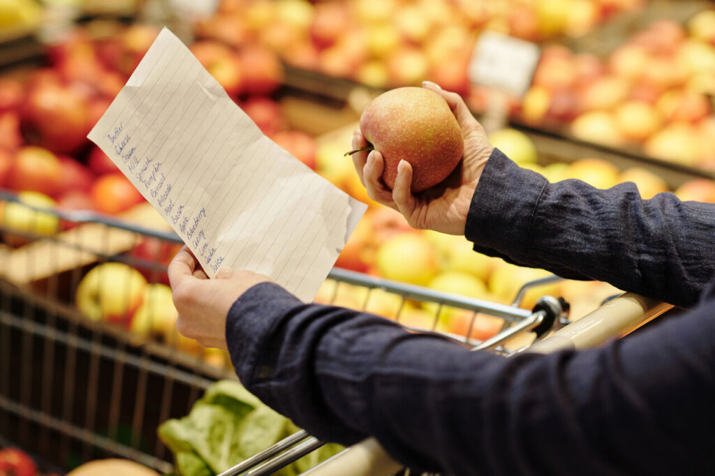
Avoiding overspending begins with awareness of how layout influences behavior. Entering the store with a clear list reduces the impact of visual distractions. Sticking to that list limits exposure-driven purchases. Planning meals ahead of time also narrows focus and reduces wandering through unnecessary aisles. Preparation strengthens discipline. Clear goals reduce impulse temptation. Structured planning increases efficiency. Organized lists improve decision speed. Faster decisions reduce exposure to persuasive displays. Focused shopping minimizes unplanned aisle exploration. Written lists also create accountability during checkout. Reviewing the cart before paying allows last-minute corrections.
Timing and route matter as well. Shopping during less crowded hours can reduce stress and impulse decisions. Starting with essential items and avoiding unnecessary detours helps maintain discipline. Ignoring end caps unless they match planned needs can significantly cut extra spending. Calm environments improve decision clarity. Direct routes limit distraction. Focus reduces impulse additions. Shopping after eating reduces hunger-driven purchases. Reduced hunger lowers susceptibility to food marketing cues. Emotional state strongly influences purchasing control. Entering the store with adequate time prevents rushed choices.
Paying attention to unit pricing rather than promotional signage provides clearer value comparisons. Evaluating whether a bulk deal truly saves money prevents automatic upsizing. Small adjustments in awareness can counter many layout strategies. The store may be designed to encourage spending, but informed shoppers can still maintain control. Awareness strengthens financial discipline. Conscious comparison improves outcomes. Intentional habits protect budgets. Slowing down purchasing decisions reduces impulse additions. Reading shelf labels carefully often reveals hidden cost differences.