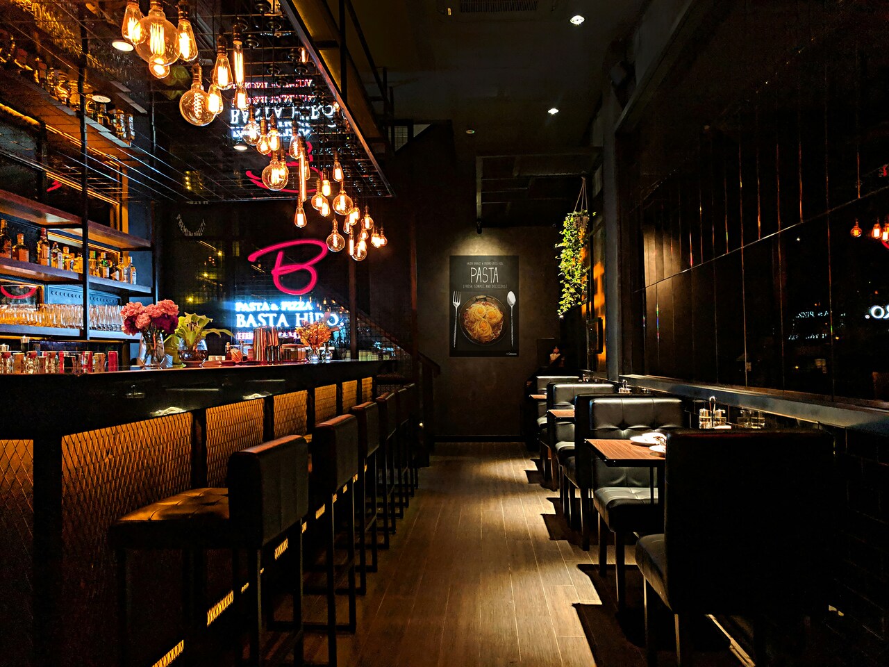
13 Supermarket Shelf Tricks That Drive Impulse Spending

A supermarket may look simple at first glance. Neatly stacked shelves, bright produce, tempting displays at every turn. Yet every aisle is carefully designed, and very little is left to chance.
From where products sit on the shelf to the music playing overhead, subtle cues guide your attention and influence your decisions. Placement, lighting, pricing, and even scent work together to shape what feels appealing and urgent.
This list explores the clever shelf strategies that quietly encourage impulse spending. Once you understand how these retail techniques work, you will never walk through the grocery store the same way again.
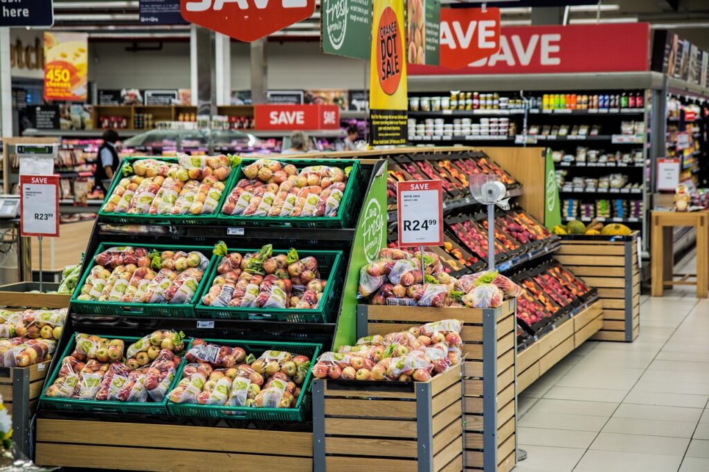
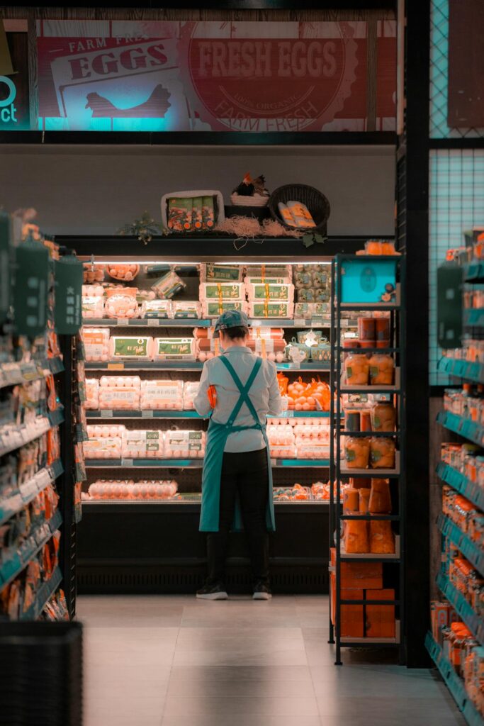
1. Eye-Level Is Buy-Level Placement
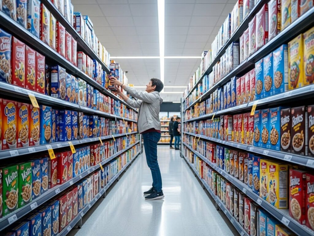
Where your eyes naturally rest often determines what lands in your cart. Supermarkets know that most shoppers scan shelves straight ahead, not up near the top or down near the floor. That central band of shelf space is prime territory, and brands pay significant slotting fees to secure it.
National brands with higher margins typically occupy eye-level positions. Store brands or lower-profit items are placed above or below, requiring more effort to locate. The extra reach or bend may seem minor, but it reduces spontaneous grabs.
Children’s cereals and snacks are often positioned at a child’s eye height. This placement directly influences requests and increases the likelihood of unplanned purchases, driven by visibility rather than need.
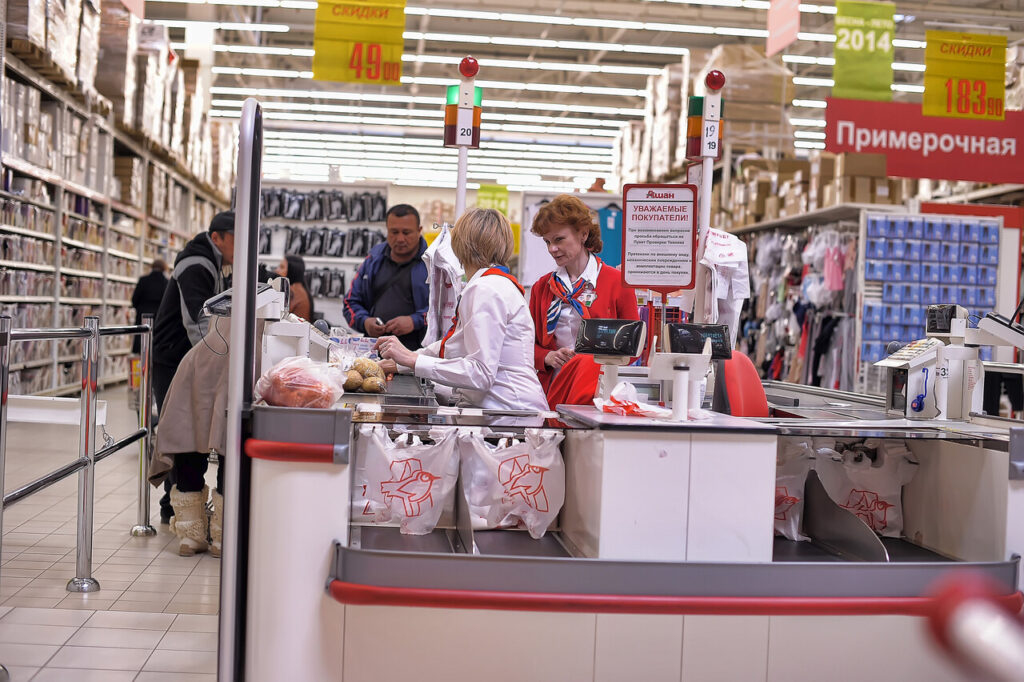
2. End Cap Displays
The end of an aisle is designed to interrupt your routine. End caps sit at natural turning points in the store, capturing attention before you even enter the aisle. Their location alone increases product exposure compared to standard shelf placement.
Brands frequently pay for these spots because of their proven sales lift. Items displayed here are not always discounted, but bold signage and stacked presentation suggest urgency or promotion. Many shoppers assume they are seeing a deal.
This perception reduces comparison shopping. Instead of checking prices along the aisle, customers often place the end cap item directly into their cart, influenced by visibility and implied value.
3. Strategic Lighting and Spotlighting
Light quietly shapes how food looks and feels. Supermarkets use warmer lighting over the bakery and prepared foods to enhance golden tones. Produce sections often rely on bright, focused lighting to intensify color and freshness cues.
In meat and seafood cases, specific light spectrums can make products appear redder or more vibrant. This does not change quality, but it influences perception at a glance. Shoppers tend to equate brightness and color saturation with freshness.
When a product looks appealing under enhanced lighting, hesitation decreases. Visual appeal often overrides careful inspection, leading to quicker decisions and higher impulse purchases.
4. Scent Marketing Near Entrances
The smell of fresh bread near a store entrance is rarely accidental. Many supermarkets position bakeries or rotisserie stations at the front to release warm, appetizing aromas as shoppers walk in.
Scent is directly tied to memory and appetite. Pleasant food smells can increase hunger, and hungry shoppers are more likely to buy additional items beyond their list. This effect has been observed across retail environments.
The aroma also creates an overall impression of freshness and activity. Even packaged goods benefit from the atmosphere. The store feels lively and abundant, which encourages relaxed and often less restrained spending.
5. Checkout Lane Temptations
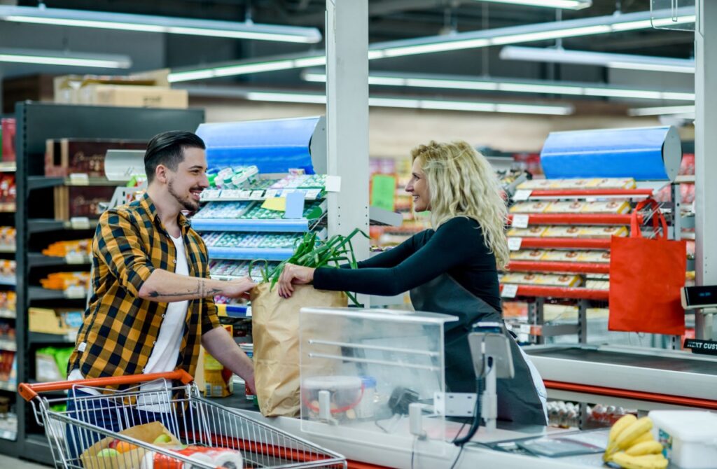
The checkout area is designed for last-minute influence. By the time shoppers reach the register, cognitive energy is lower. Decisions feel smaller compared to the main purchases already in the cart.
Items placed here are compact, inexpensive, and high-margin. Candy, small electronics, and novelty snacks require little consideration. Their placement at arm’s reach reduces effort and increases the likelihood of purchase.
Because the price point seems minor relative to the total bill, resistance drops. Individually, these additions appear insignificant. Across thousands of transactions each day, however, these impulse buys contribute substantial incremental revenue for the store.
6. Limited-Time Signage
Scarcity is a powerful psychological trigger in retail. When shoppers see phrases like limited time or while supplies last, the message creates urgency, even if the product is regularly restocked. The wording shifts attention from whether the item is needed to whether the opportunity might disappear.
Research shows perceived scarcity increases desirability. When availability feels restricted, people assign higher value to the product. This shortens decision time and reduces comparison with nearby alternatives.
Instead of evaluating price per unit or considering substitutes, shoppers focus on not missing out. The framing shifts attention from cost to timing, and impulse often replaces careful deliberation.
7. Bundle Pricing
Multi-buy promotions are designed to feel financially smart. Signs such as two for a set price or buy three and save encourage shoppers to focus on savings rather than need. Even when a single unit costs almost the same, the bundle appears more economical.
Consumers respond strongly to deal framing. Grouped offers activate the desire to maximize value, sometimes overriding realistic consumption habits.
Retailers often apply bundle pricing to higher-margin items. Increased volume moves inventory efficiently while protecting profitability. The promotion feels like a win, yet it is structured to raise basket size without sacrificing return.
8. Decoy Pricing
Pricing structures are rarely accidental. Retailers often introduce a third option specifically to steer attention toward a more profitable choice. This tactic, known as the decoy effect, works by altering comparison rather than changing the product itself.
For instance, a medium-sized priced only slightly below a large makes the large appear like the smarter value. The presence of the less attractive middle option reframes the larger one as economical, even if it exceeds the shopper’s original intention.
Consumers believe they are making a logical, value-driven decision. In reality, the comparison has been engineered. The added option quietly shifts perception and increases the likelihood of selecting a higher-margin product.
9. Music Tempo and Volume
Sound shapes behavior in subtle but measurable ways. Slower background music encourages shoppers to move at a relaxed pace, increasing the time spent browsing aisles and encountering more products.
Tempo adjustments are often deliberate. During quieter hours, calm music promotes lingering. At peak times, slightly faster tracks can improve traffic flow without reducing spending. Volume is kept moderate to maintain comfort and reduce distraction.
Mood plays a key role in purchasing decisions. When shoppers feel relaxed and unhurried, they are more receptive to impulse buys. Extended time in-store generally correlates with higher basket totals, even without conscious intent.
10. Cross-Merchandising Displays
Placing complementary items together reduces friction in decision-making. When pasta appears next to sauce, or tortilla chips sit beside salsa, the visual pairing sparks immediate associations.
This arrangement simplifies meal planning. Instead of recalling every ingredient from memory, shoppers see suggestions directly in front of them. The convenience feels supportive rather than promotional.
By clustering related products, stores increase the chance of add-on purchases. Each small addition may seem minor, but collectively these extra items raise the average transaction value while maintaining the appearance of helpful organization.
11. Oversized Shopping Carts
The size of a shopping cart may seem like a simple design choice, but it affects buying behavior. Over time, cart capacity has increased in many supermarkets. When shoppers place only a few items inside, the extra space creates the impression that the cart is still empty.
That sense of emptiness influences perception. Research shows people rely on visual cues to judge adequacy. A half-filled small basket feels complete, while the same items in a large cart can feel insufficient.
As shoppers move through the store, that visual gap encourages extra purchases. The space suggests there is room for more, and without a clear stopping point, totals often rise before checkout.
12. Price Anchoring with Premium Options

Price anchoring works by establishing a reference point before a decision is made. When a very expensive item sits beside moderately priced alternatives, it sets a psychological benchmark for what feels costly.
Once that anchor is in place, mid-range products appear more reasonable, even if they exceed the shopper’s initial budget. Consumers often avoid the cheapest option to maintain perceived quality, making the middle choice especially attractive.
Retailers design this structure carefully. The premium item may not sell in high volume, but it frames the context. Within that comparison, spending slightly more feels rational and balanced rather than excessive.
13. Sample Stations and Tastings
A free sample lowers the barrier between curiosity and commitment. When shoppers taste a product, uncertainty about flavor, texture, or quality disappears. That immediate sensory feedback builds confidence in the purchase.
Sampling also taps into a social principle known as reciprocity. Receiving something at no cost can create a subtle impulse to respond positively, often by buying the featured item.
Because the experience happens in real time, decision cycles shorten. Instead of postponing consideration, shoppers act on fresh impressions. As a result, products demonstrated in-store frequently see noticeable, if temporary, increases in sales.