12 Supermarket Products That Look Premium but Are Secretly Budget Brands in Disguise
A quick walk through the supermarket can feel like a tour of premium food trends, with sleek packaging, muted colors, and carefully chosen words promising quality and craftsmanship. Many of these products look like they belong in specialty shops or boutique markets. In reality, a surprising number of them are budget-friendly private-label items dressed up to feel luxurious. Understanding how design, placement, and language influence perception helps shoppers separate true quality from clever presentation. When you know what to look for, you can appreciate these products for what they are and decide whether you are paying for substance or simply for the look.
1. Store-Brand Coffee in Minimalist Packaging
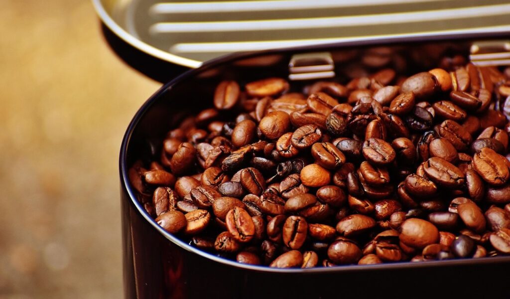
Minimalist coffee packaging signals quality before a shopper ever reads the label. Clean typography, muted colors, and short descriptions closely resemble independent roasters, encouraging the assumption that the beans are carefully sourced or roasted in small batches. In reality, many of these coffees are private-label products made by large commercial roasters that supply multiple supermarket chains. The beans are often commodity grade, blended for consistency rather than complexity, and roasted at scale to keep costs predictable. That does not make the coffee poor quality. It is usually reliable and drinkable. The premium illusion comes from design choices, not origin or process.
2. Artisan-Style Bread from the Bakery Section
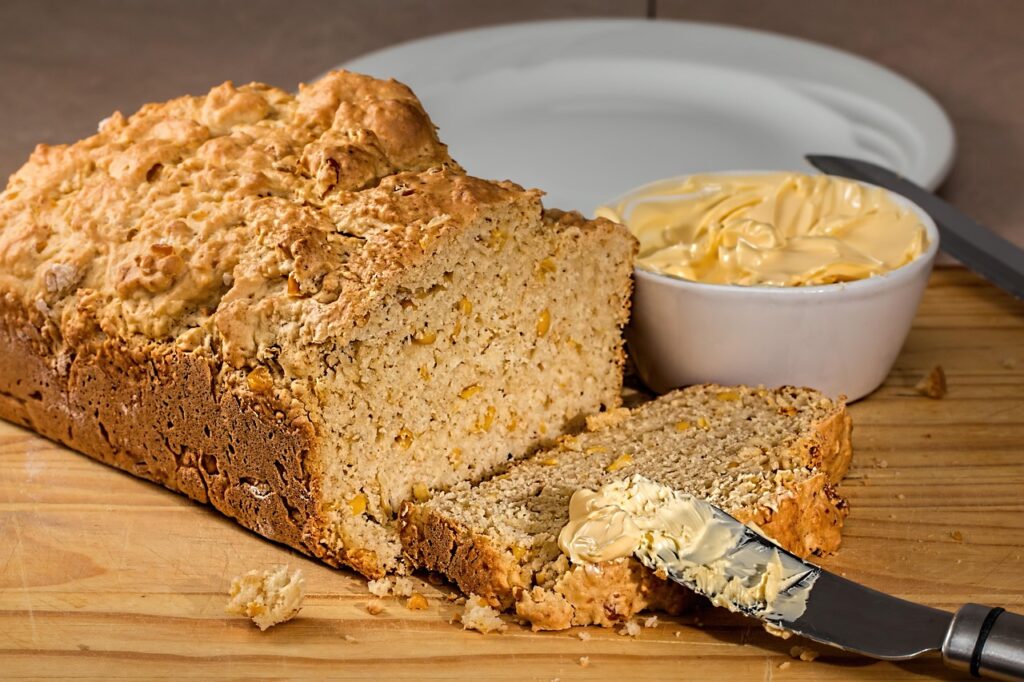
Supermarket bakery bread often looks handcrafted through visual cues like uneven shapes, flour dusting, and brown paper packaging. Words such as hearth baked or farmhouse style suggest small-scale baking and traditional methods. In practice, many of these loaves are produced in centralized factories, frozen, and shipped to stores where they are baked or reheated. This bake-off model allows supermarkets to fill stores with fresh aromas without running full bakeries. The ingredient lists and dough formulations are often similar to standard packaged bread. What changes is shape, scoring, and presentation.
3. Organic-Looking Pasta and Sauces
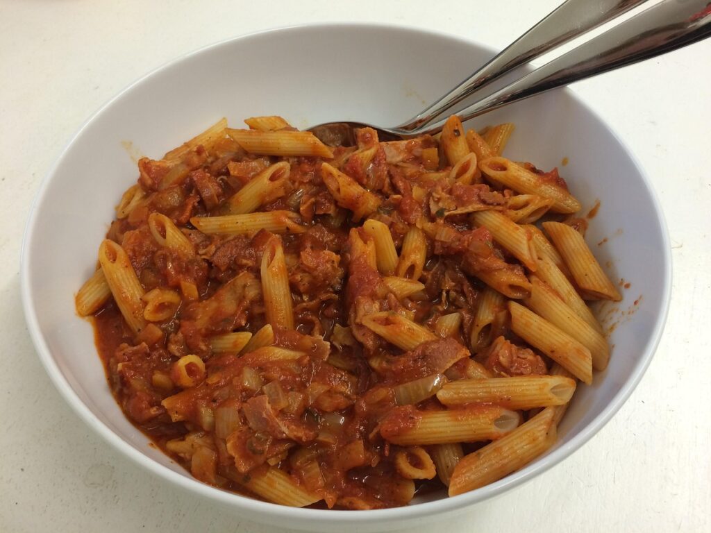
Pasta and sauces dressed in earthy colors, hand-drawn illustrations, and rustic language signal care and authenticity. These visual cues encourage shoppers to believe the products are made using traditional or small-batch methods. In reality, many are private-label items produced in the same large facilities that make lower-priced versions. Ingredient lists are often nearly identical, with changes limited to branding and jar design. Pasta is frequently extruded through standard dies rather than slower bronze dies, and sauces use consistent base recipes adjusted slightly for flavor. Even when organic certifications apply, the premium look does not always reflect different production methods.
4. Gourmet Ice Cream Pints

Small ice cream pints wrapped in matte finishes and subtle color palettes strongly resemble premium dessert brands. Supermarkets use this design language for private-label ice creams to signal indulgence and quality. Inside, the ice cream often uses conventional stabilizers, familiar milk fat levels, and standard flavor bases. The same manufacturers may produce multiple brands with only minor recipe variations. What separates them is branding, not structure. Creative flavor names and minimalist packaging raise expectations, even when the product is priced closer to budget ice cream. The result feels upscale in the freezer aisle, even though the recipe itself remains firmly mainstream.
5. Fancy Sparkling Water

Sparkling water feels upscale when wrapped in slim cans, pastel tones, and European-inspired names. Many supermarket versions borrow this aesthetic while being produced domestically using filtered municipal water and carbonation. Mineral content is often minimal or adjusted for consistency rather than naturally sourced. Flavor essences are added sparingly to maintain a clean taste. Because the base product is simple, branding becomes the main differentiator. Private-label sparkling water offers high margins while competing visually with imported brands. The premium look suggests heritage and sourcing that usually do not exist.
6. Specialty Cheese Packs
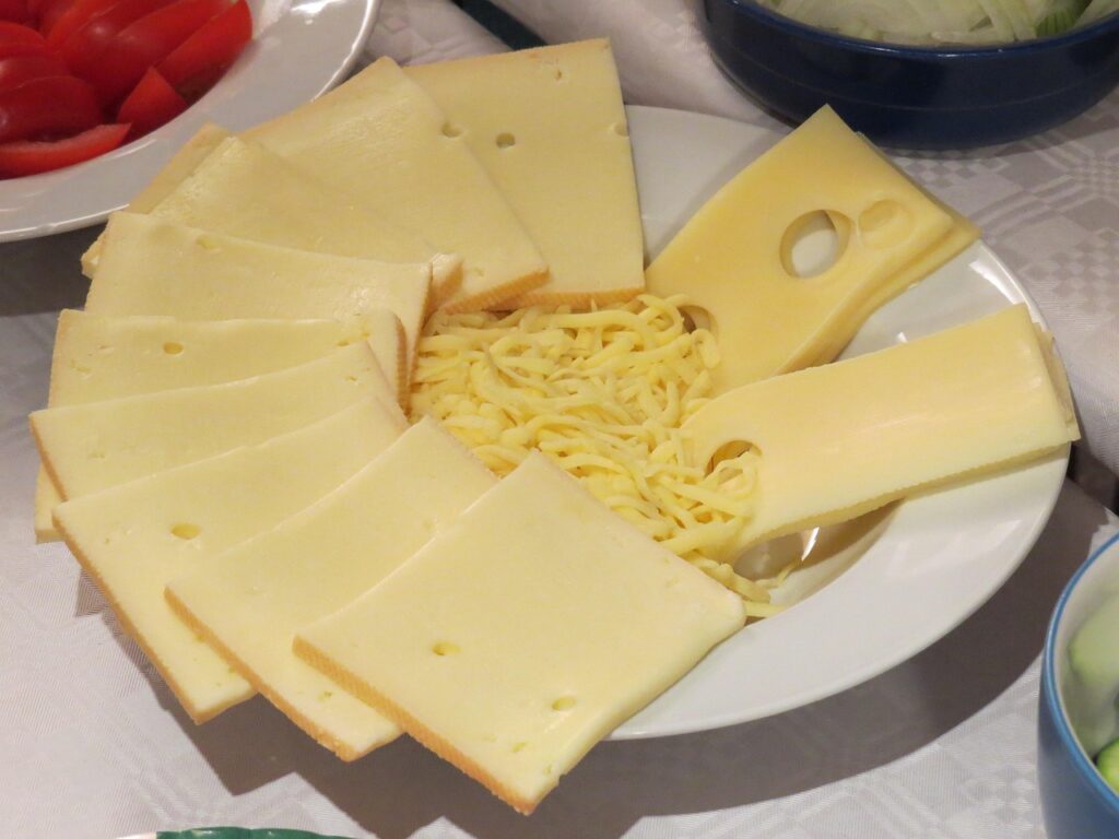
Small cheese wedges wrapped in elegant paper or clear film appear curated and exclusive. Labels often emphasize tradition, aging, or region, suggesting limited production. In reality, many of these cheeses come from the same producers that supply bulk blocks sold at lower prices. The cheese is cut into smaller portions and repackaged to feel special. Aging time, milk source, and production methods may be identical across price tiers. Portion size and presentation create the premium perception, allowing higher prices per pound without changing the product itself. Shoppers who compare producer names often find identical origins across different packaging styles.
7. Cold Brew Coffee Bottles
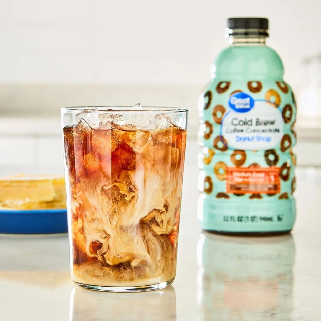
Cold brew bottles often rely on clear glass, neutral labels, and restrained wording to imply careful brewing and specialty beans. Many store-brand versions are made from concentrate brewed in large batches, then diluted and bottled for wide distribution. The coffee itself is often sourced from standard blends chosen for consistency rather than distinctive flavor. Cold brew naturally tastes smooth, which supports the premium illusion. The aesthetic borrows heavily from independent cafés, while production follows industrial efficiency. The result feels artisanal on the shelf but operates on scale behind the scenes.
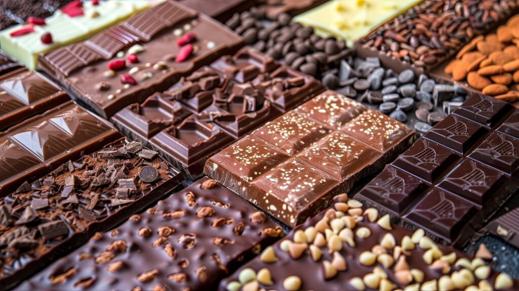
8. Luxury Chocolate Bars
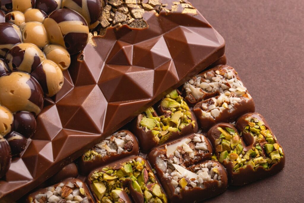
Dark wrappers, elegant fonts, and high cocoa percentages suggest refinement and depth. Store-brand chocolate frequently adopts these cues while using conventional cocoa sourcing and standard processing methods. Sugar and fat ratios often mirror budget chocolate, with flavor differences achieved through minor formulation changes. The packaging does most of the storytelling, implying craftsmanship and exclusivity. While the chocolate may be enjoyable, it is rarely produced in small batches or with rare cacao varieties. The sense of luxury comes from visual restraint rather than ingredient transparency or origin control.
9. Prepared Deli Salads

Prepared deli salads look premium thanks to clear containers, neat presentation, and upscale naming. Many are produced in centralized kitchens using standardized recipes designed for shelf stability and cost control. Ingredients are chosen for consistency rather than seasonality, then distributed to stores for display. Placement in the deli case reinforces the idea of freshness and craftsmanship. In reality, preparation mirrors efficiency-driven food service production. The premium feel comes from packaging and context, not unique preparation or sourcing. These salads are formulated to look appealing over time, not to reflect same-day preparation.
10. Plant-Based Milk Alternatives
Plant-based milks often feature clean design and lifestyle-focused language that emphasizes wellness and sustainability. Many premium-looking cartons are private-label products produced by the same facilities that make lower-priced alternatives. Ingredient lists are typically similar, consisting of water, base grain or nut, oil, and stabilizers. Branding and shelf placement create differentiation. The premium appearance encourages shoppers to associate the product with higher quality, even when production methods and formulations remain consistent across price tiers. Small differences in texture or flavor are usually achieved through minor adjustments, not superior sourcing.
11. Frozen Chef-Inspired Meals

Frozen meals with elegant boxes and chef-driven language suggest restaurant-quality cooking. Inside, these meals are often produced using the same industrial processes as budget frozen dinners. Ingredient sourcing focuses on shelf life and cost efficiency. Portion sizes and nutritional profiles are frequently similar to lower-priced options. The premium positioning allows supermarkets to charge more without significantly increasing production costs. The upgrade exists visually rather than structurally. Plated food photography and descriptive language do most of the persuasive work. The eating experience rarely differs enough to justify the premium once packaging is removed.
12. Olive Oil with Rustic Labels
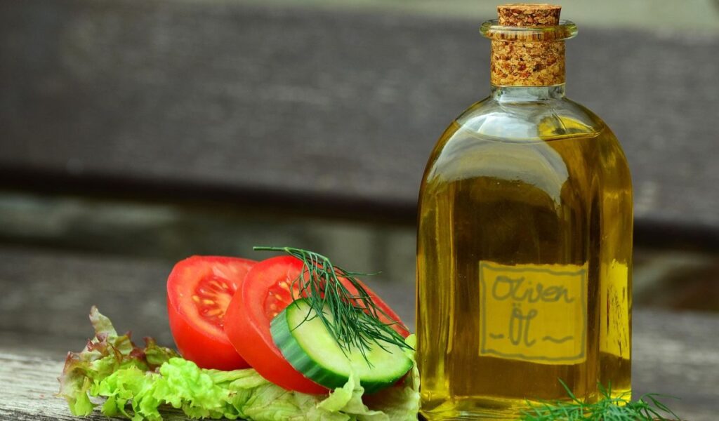
Olive oil bottles decorated with rustic fonts and imagery of groves suggest tradition and heritage. Many contain blends sourced from multiple regions, refined for consistency rather than flavor character. They meet basic standards but lack the traceability or complexity associated with true premium oils. Packaging creates an old-world story that distracts from sourcing reality. Checking harvest dates and origin details often reveals the oil’s budget positioning beneath the surface appeal. Refined blends are designed to be neutral and stable rather than expressive or distinctive. The label often communicates more romance than the oil itself delivers in the kitchen.