10 Colorful Dishes That Look Amazing but Disappoint on Flavor
Color has a powerful way of shaping our expectations about food. Bright shades suggest bold flavor, freshness, and excitement long before the first bite ever happens. The problem is that visual impact does not always translate into satisfying taste. Many highly photogenic dishes lean heavily on appearance, novelty, or artificial color while flavor balance, texture, and depth quietly fall behind. When expectations rise too high, even decent food can feel disappointing. These dishes remind us that great cooking depends on harmony between what we see and what we actually experience on the plate.
1. Dragon Fruit Bowls That Promise Tropical Punch but Deliver Subtle Sweetness
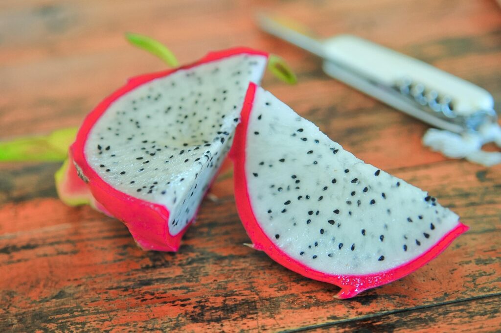
Dragon fruit looks like something designed for a magazine cover rather than a grocery shelf. The neon pink skin and speckled white or magenta flesh signal bold flavor, leading many people to expect something sweet, tangy, or richly tropical. In reality, dragon fruit is extremely mild. Its flavor lands closer to lightly sweet cucumber or pear, which can feel underwhelming when eaten on its own or used as the star of a bowl. Texture also plays a role. The soft, slightly watery flesh lacks the juiciness people associate with berries or mangoes. When blended into smoothie bowls, the vibrant color remains stunning, but the taste often disappears behind stronger toppings like granola or honey.
2. Rainbow Macarons That Look Like Art but Often Taste One-Dimensional

Macarons draw attention instantly with glossy shells in pastel blues, pinks, greens, and yellows stacked like edible paint chips. Their visual appeal sets high expectations for flavor complexity and indulgence. Yet many mass-produced or poorly executed macarons taste overly sweet, dry, or oddly hollow in the center. The almond meringue shells can dominate the bite, while fillings sometimes lack strong flavor or freshness. Texture matters as much as taste here. A proper macaron should have a crisp shell and a soft, chewy interior, but many versions miss that balance. When color becomes the primary selling point, flavor quality often takes a back seat. The result can feel more like sugar candy than a layered dessert, leaving people admiring the look more than enjoying the eating experience.
3. Matcha Lattes That Photograph Beautifully but Polarize Palates
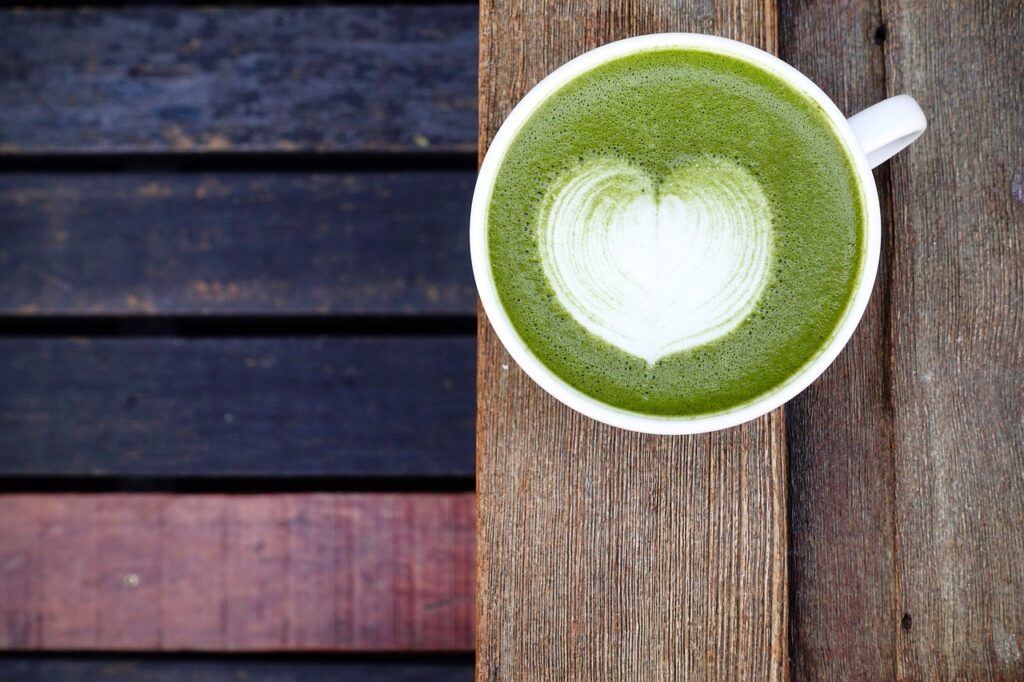
The bright green foam and layered milk designs make matcha lattes visually irresistible. Social media has helped elevate matcha into a symbol of wellness and café culture. Flavor, however, is divisive. High-quality matcha has grassy, slightly bitter notes that some people find refreshing and others find unpleasant. Lower quality powders can taste dusty, flat, or overly vegetal. Sweeteners and milk may soften the bitterness, but they can also mask the subtle tea complexity. Many first-time drinkers expect something sweet and creamy, like a flavored latte, and are surprised by the earthy profile. The color suggests vibrancy and energy, but the taste requires an acquired palate that not everyone develops.
4. Gummy Candy Assortments That Look Like Fruit but Taste Like Sugar
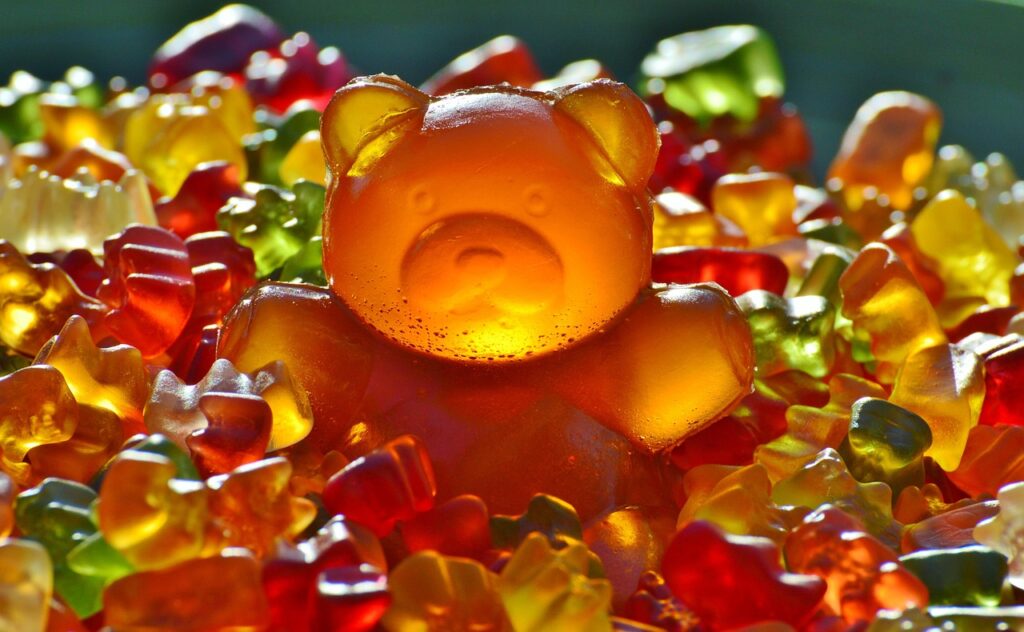
Multi colored gummy candies promise playful fruit flavors through bright reds, blues, greens, and yellows. The shapes and colors suggest variety and intensity, yet the flavor profile often collapses into a generic sweetness with only faint differences between colors. Artificial flavoring and heavy sugar dominate the taste, leaving little nuance. Texture fatigue also sets in quickly as chewing through sticky candies becomes tiring. The contrast between visual excitement and flavor simplicity makes gummies a common disappointment after the novelty fades. They look like a rainbow of flavors but frequently deliver only sugar and chew.
5. Coconut Sago Desserts That Look Luxurious but Taste Muted
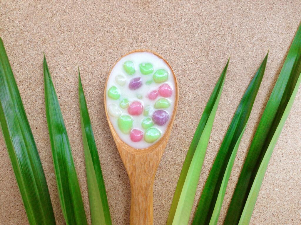
Coconut sago desserts often arrive layered with translucent pearls, colorful fruit, and creamy white bases that look rich and refreshing. The expectation is tropical depth and indulgence. In practice, many versions lack a strong coconut flavor, especially when diluted with excess water, ice, or low-fat substitutes. The sago pearls themselves are neutral and depend entirely on the surrounding liquid for flavor. If the coconut milk is thin or lightly sweetened, the dessert can feel bland and watery. The visual complexity does not always translate into sensory satisfaction, leaving diners impressed by appearance but underwhelmed by taste.
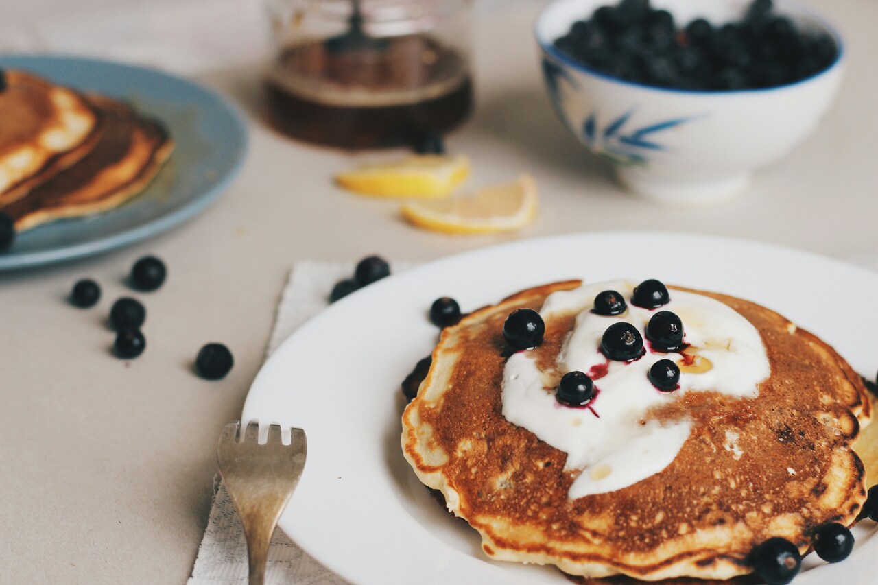
6. Rainbow Smoothie Bowls That Trade Flavor Balance for Visual Drama
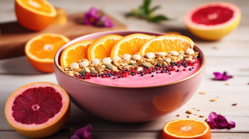
Smoothie bowls stacked in colorful layers of berries, mango, spinach, and dragon fruit look stunning in photos. Achieving those vibrant colors often requires separating ingredients rather than blending them for optimal flavor balance. This can create uneven sweetness, icy textures, or diluted taste in certain layers. The frozen fruit needed for visual structure may dull flavor intensity compared to fresh blends. Toppings can overpower the base rather than complement it. The bowl becomes more of a design project than a cohesive eating experience, making it beautiful to photograph but less satisfying to eat.
7. Fruit Swirled Kombucha That Looks Refreshing but Tastes Sharp
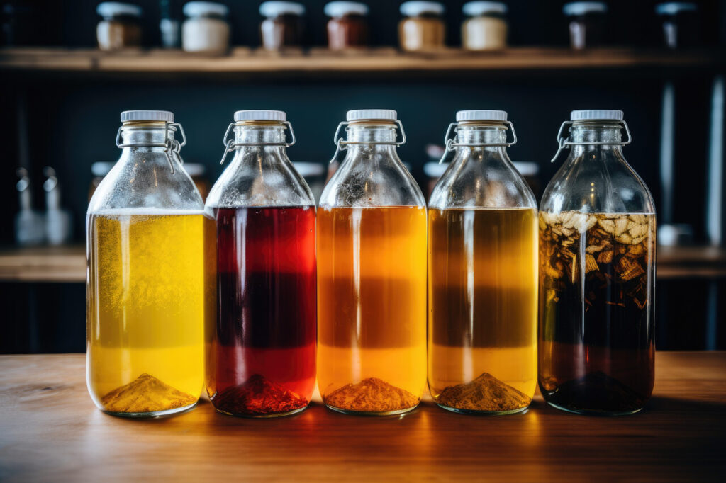
Bottles of kombucha with swirling fruit colors appear refreshing and vibrant on shelves. The reality is that kombucha remains fundamentally acidic and fermented. The fruit infusion often adds aroma and color more than sweetness or depth. For new drinkers, the tangy, vinegary edge can overpower expectations of fruity refreshment. Carbonation can amplify sharpness and leave a lingering bite. While many fans appreciate its complexity, the disconnect between bright visuals and aggressive flavor can lead to disappointment for those expecting juice-like sweetness.
8. Festival Foods Coated in Color That Prioritizes Spectacle Over Taste
Fair foods dipped in neon batters, colored sugars, or glitter coatings attract attention instantly. The colors signal fun and indulgence, but the underlying food often lacks quality or balance. Heavy frying masks flavor, sugar overwhelms nuance, and novelty toppings rarely improve texture. These foods aim to entertain visually and socially rather than deliver refined taste. After a few bites, greasiness and sugar fatigue set in, reminding diners that spectacle does not equal satisfaction.
9. Pastel Crème Brûlée That Looks Elegant but Misses Textural Contrast
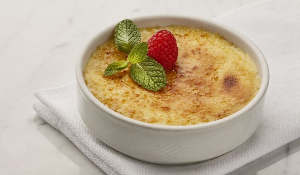
Colored brûlée tops and pastel custards look sophisticated and modern. The problem arises when color treatments interfere with proper caramelization. The sugar crust may not crack cleanly or develop the deep caramel flavor that defines a good brûlée. Custard underneath can lack vanilla intensity or feel overly gelatinous. The visual innovation can compromise the essential balance between creamy interior and brittle top, leaving a dessert that looks refined but tastes flat.
10. Layered Panna Cotta and Gelée Desserts That Impress the Eye More Than the Palate
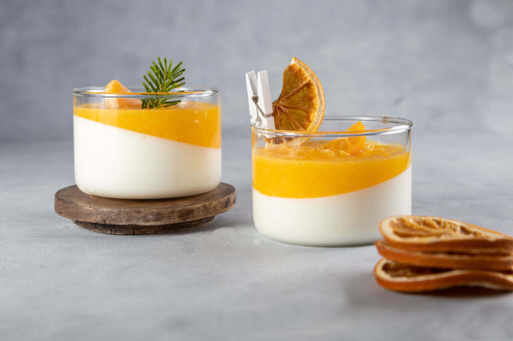
Layered panna cotta desserts often feature translucent fruit gels stacked over creamy bases, creating a jewel-like appearance. The challenge lies in achieving a strong flavor in both layers. Gelée often tastes lightly sweet but lacks fruit depth, while panna cotta can taste mostly of cream unless properly infused. Texture contrast may feel pleasant, but flavor remains muted. These desserts photograph beautifully but rely heavily on visual appeal rather than bold taste, making them memorable for appearance more than enjoyment.