11 Fast Food Items That Look Different From Promotional Photos
Fast food advertising is designed to make menu items look as appealing as possible. Promotional photos are carefully styled so that every ingredient appears fresh, neatly layered, and perfectly arranged. In real restaurant kitchens, however, food is prepared quickly to keep service moving. This difference between staged photography and fast-paced assembly often means the final product looks less polished than the image on the menu. While the taste may remain the same, the visual contrast between advertisement and reality is something many customers notice when opening their order.
1. Big Mac
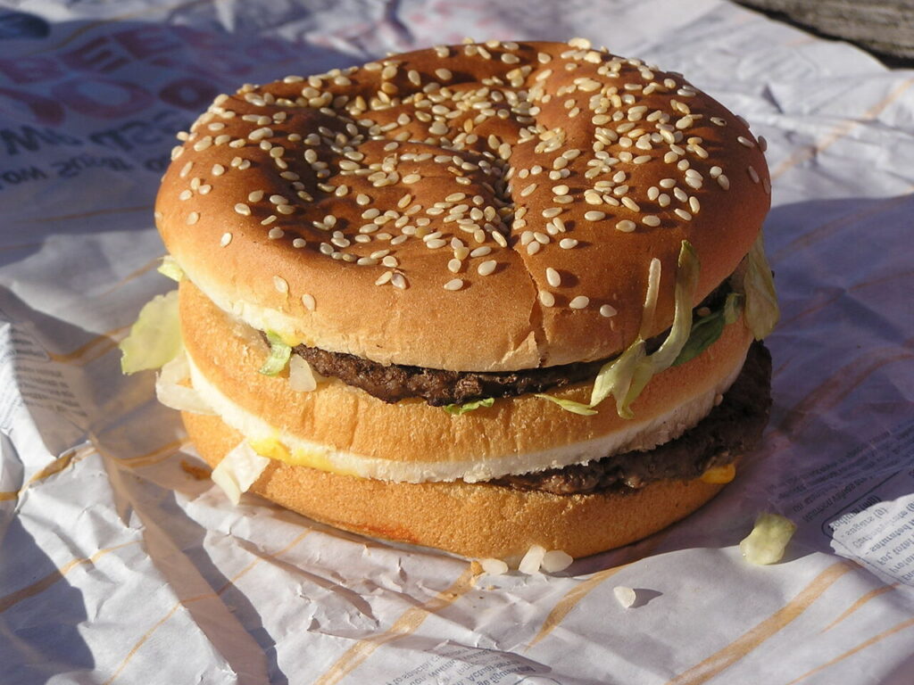
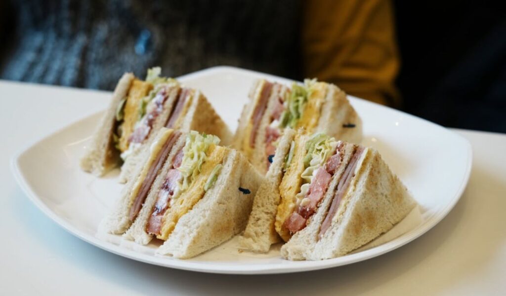
Few fast food burgers are as recognizable as the Big Mac. The stacked bun, two beef patties, lettuce, cheese, pickles, and special sauce have become an iconic image in advertising.
The reality can look quite different. Fast food photography is carefully staged so that each ingredient is visible and evenly arranged. In a busy restaurant kitchen, sandwiches are assembled quickly to keep service moving.
Because of this difference in preparation, the final burger often appears flatter and slightly less structured than the photo. Ingredients may shift inside the bun during wrapping or transport. While the flavor remains the same, the presentation rarely matches the polished look created for advertisements.
2. Whopper
The Whopper has long been promoted as Burger King’s signature burger. Advertisements usually show a thick flame-grilled patty surrounded by crisp vegetables, bright tomato slices, and a perfectly rounded bun. The image emphasizes freshness and generous portions.
Food photography teams carefully build these images to highlight each ingredient. Tomatoes are chosen for uniform size, lettuce is arranged to appear full, and sauces are applied so they remain visible to the camera. Lighting and styling further enhance the colors and textures.
In everyday restaurant service, the burger is assembled in seconds. The vegetables may shift, the bun can compress slightly, and the overall sandwich often appears flatter than the promotional version.
3. Baconator
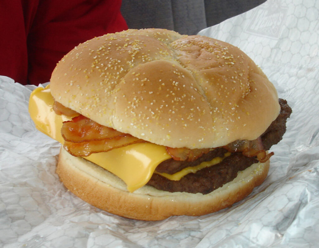
The Baconator from Wendy’s is famous for its stacked layers of beef, bacon, and cheese. Marketing images often show thick strips of bacon neatly placed across the patties, creating the impression of a towering sandwich packed with meat.
These promotional photos are carefully arranged to emphasize abundance. Bacon strips are selected for size and positioned so they extend beyond the bun. Cheese slices are melted just enough to look glossy without losing their shape.
When prepared during regular service, the sandwich may look less dramatic. Bacon pieces can fold or overlap, and the patties often compress slightly when wrapped. The result still contains the same ingredients, but the visual impact can feel less impressive than the advertisement.
4. Crunchy Taco
Taco Bell’s crunchy taco is often shown in advertisements as a neatly filled shell with layers of seasoned beef, lettuce, and cheese visible from every angle. The shell looks perfectly shaped, and the toppings appear evenly distributed.
In reality, tacos are assembled quickly during busy service periods. The filling may settle toward one side of the shell, and ingredients can shift during wrapping or packaging.
The difference is largely due to how promotional photos are prepared. Stylists often place fillings carefully inside the shell so that each ingredient remains visible to the camera. Real tacos are built for speed and consistency rather than perfect visual balance.
5. Italian Meatball Sub
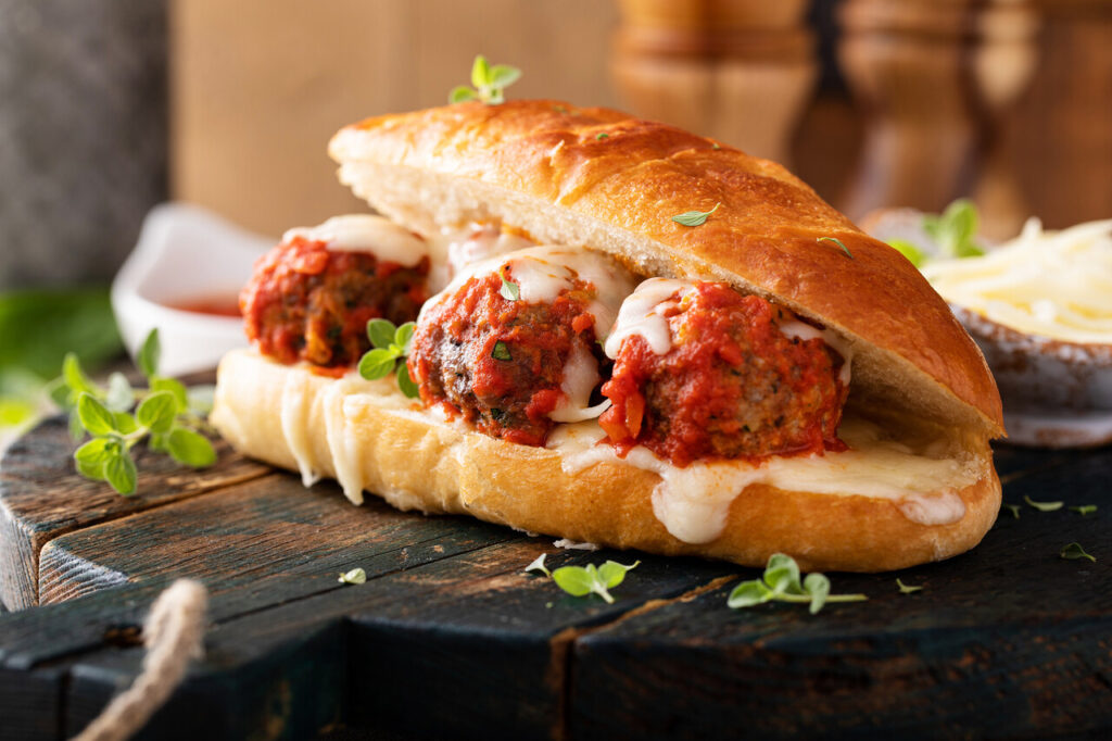
The Italian meatball sub from Quiznos is often advertised as a generously filled sandwich with large meatballs and plenty of sauce. In promotional photos, the bread appears stuffed with evenly spaced meatballs that create a full, rounded shape.
Food stylists arrange each meatball carefully so the sandwich looks abundant. The sauce is arranged to highlight the ingredients without making the bread appear soggy. The final image emphasizes a balanced and hearty filling.
During regular preparation, the sandwich may look slightly different. Meatballs can shift inside the bread, and the sauce may settle unevenly. While the portion remains consistent with the recipe, the visual presentation may appear less full than the advertisement.
6. Three Cheese and Bacon Sandwich
Arby’s three cheese and bacon sandwich is often presented in marketing images with clearly visible layers of cheese and crispy bacon. The sandwich looks carefully stacked so that each ingredient stands out.
Promotional food photography places a strong focus on visual clarity. Cheese slices are positioned so they remain visible along the edges, while bacon strips are arranged to highlight their texture.
When the sandwich is prepared during regular service, the ingredients are assembled more quickly. Cheese may melt deeper into the sandwich, and bacon pieces may shift as the bread is handled. These changes create a sandwich that tastes the same but appears less carefully arranged.
7. Chicken Club Sandwich
The chicken club sandwich is often promoted with a thick chicken fillet, crisp lettuce, tomato slices, and bacon layered neatly under a soft bun. Advertisements highlight the size and structure of the sandwich to emphasize its value.
Photographers use carefully selected ingredients to achieve this look. Chicken fillets are often chosen for their shape, and toppings are arranged so that each layer remains visible.
In everyday preparation, the sandwich may appear more compact. The bun can compress slightly, and the toppings may move during assembly or packaging. These small changes are common in fast food service, where speed and consistency are priorities.
8. Burger King Hot Dog
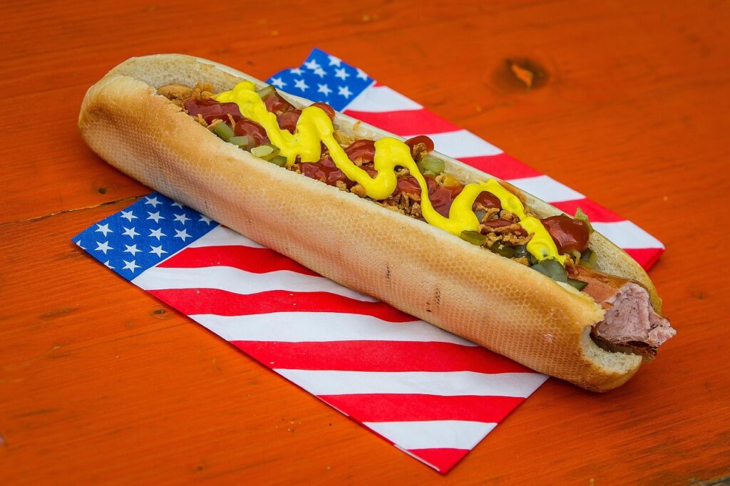
Burger King’s hot dogs were advertised with toppings that appeared evenly spread across the sausage. Promotional images often showed bright condiments and generous layers of onions or relish.
To achieve this appearance, stylists arrange the toppings carefully along the length of the hot dog. The goal is to ensure every ingredient remains visible in the final photo.
In practice, toppings can shift as the hot dog is wrapped or moved. Condiments may settle toward one side, and the bun may compress slightly. While the ingredients remain the same, the presentation can look less symmetrical than the promotional version.
9. P’zolo Sandwich
The P’zolo sandwich from Pizza Hut was marketed as a handheld pizza filled with meat, cheese, and sauce inside baked dough. Promotional images often show thick fillings stretching across the entire sandwich.
These images are carefully staged to emphasize the amount of ingredients inside the bread. The fillings are arranged so they remain visible once the sandwich is sliced or opened.
In everyday preparation, the filling may settle inside the dough as it bakes. The sandwich can appear flatter than the promotional version, especially once it is packaged and transported. The flavor remains consistent, but the visual presentation can vary.
10. Eggs Benedict Sandwich
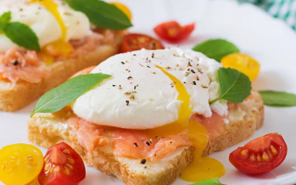
The Eggs Benedict sandwich introduced by Dunkin’ was advertised with a neatly stacked egg, Canadian bacon, and sauce layered inside a toasted bun. Promotional photos highlight the shape and balance of the sandwich.
In advertising shoots, ingredients are often placed carefully to keep the sandwich looking structured. The egg is positioned so the edges remain visible and the sauce appears evenly spread.
During regular service, the sandwich may look slightly different. The egg and bacon can shift inside the bun, and the sauce may spread unevenly. These changes are common when food is assembled quickly and packaged for takeout.
11. McLobster Sandwich
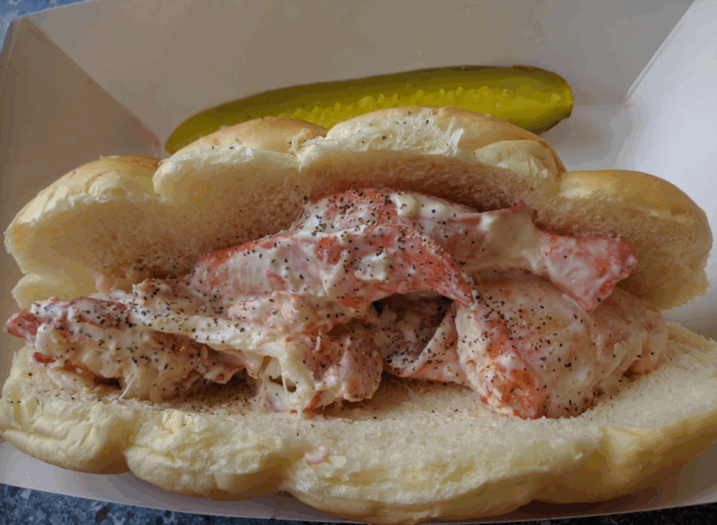
The McLobster sandwich is marketed as a seafood option featuring chunks of lobster meat inside a soft roll. Promotional images typically show large pieces of lobster filling the sandwich from end to end.
Food stylists arrange the seafood carefully so the roll appears generously filled. The pieces are spaced evenly, and the roll is shaped to maintain a full appearance. This arrangement ensures that every visible section looks abundant and balanced.
In reality, the filling may settle deeper inside the bread once the sandwich is handled. While the portion remains consistent with the recipe, the visual fullness can appear less dramatic than the promotional photograph.