The Photo Promised Something Else But These 11 Restaurant Dishes Keep Getting Away With It
Menus have mastered the art of temptation. With carefully styled photos, perfect lighting, and just the right angles, dishes are presented as irresistible, larger-than-life experiences that set expectations before you even order.
But once the plate arrives, the story can shift. The towering stacks look smaller, the vibrant colors feel muted, and the generous portions seem a little more restrained than promised.
This gap is not always about disappointment. It is often the result of styling techniques, kitchen realities, and the challenge of recreating perfection at scale. Still, these familiar dishes continue to charm diners, even when they do not quite match the picture.
1. Overstuffed Burgers That Arrive Flattened
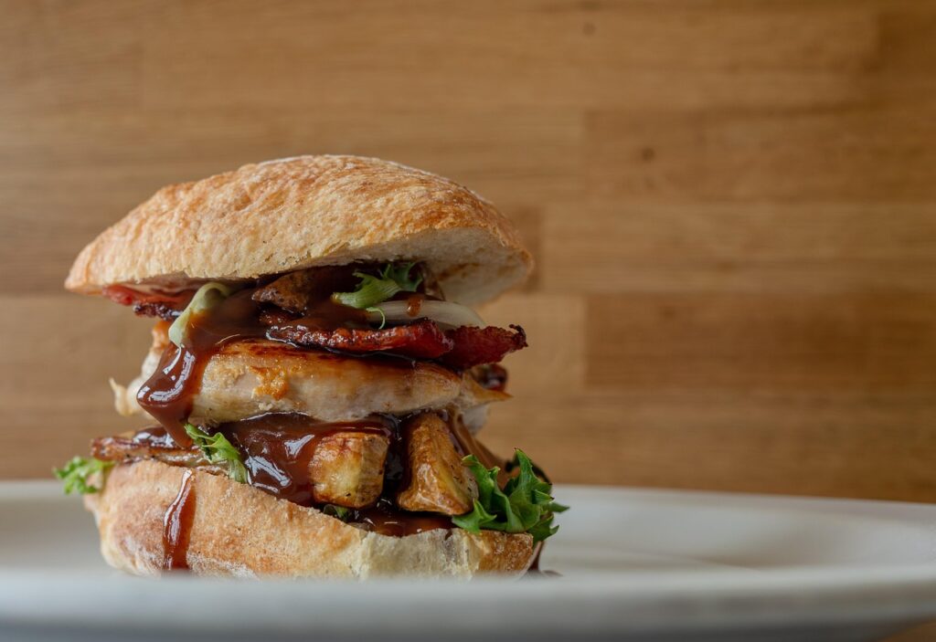
A burger in a photo is built to impress first, not to be eaten. That is why the towering stack you expect often arrives compressed and uneven on the plate.
Food stylists use supports, thicker patties, and carefully placed toppings to create height. In real kitchens, burgers are pressed during cooking and wrapped or held briefly, which naturally flattens the structure. Steam also softens the bun.
Gravity does the rest. Sauces slide, layers shift, and the neat stack collapses slightly before it reaches you. The flavor may still be satisfying, but the visual drama is difficult to preserve outside controlled conditions.
2. Loaded Nachos With Bare Chips at the Bottom
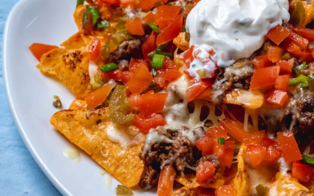
Nachos are photographed to look evenly loaded, but the real experience often reveals a very different layering once you start eating.
For speed and cost control, restaurants usually concentrate toppings like cheese, meat, and sauces on the top layer. Distributing ingredients evenly throughout requires more time and increases portion costs, especially with pricier add-ons.
This creates a strong visual first impression, but it does not always translate to consistency in every bite. As you dig deeper, plain chips appear underneath, making the contrast noticeable. It reflects a balance between presentation efficiency and ingredient use rather than a fully even build.
3. Pancake Stacks That Shrink Dramatically
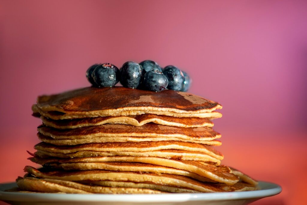
Pancakes in menu images are designed to look thick, airy, and perfectly stacked, but their real-life version often feels smaller and less structured.
During photo shoots, pancakes may be slightly undercooked or supported internally to maintain height. Syrup substitutes are also used to sit neatly on top instead of soaking in, preserving that full, layered look.
In actual service, pancakes settle quickly under their own weight. Heat and moisture cause them to soften, and syrup absorbs almost immediately. This reduces volume and definition, making the stack appear flatter while still delivering the same familiar taste and comfort.
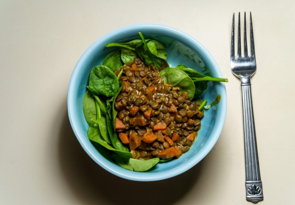
4. Pasta Bowls That Look Half Empty
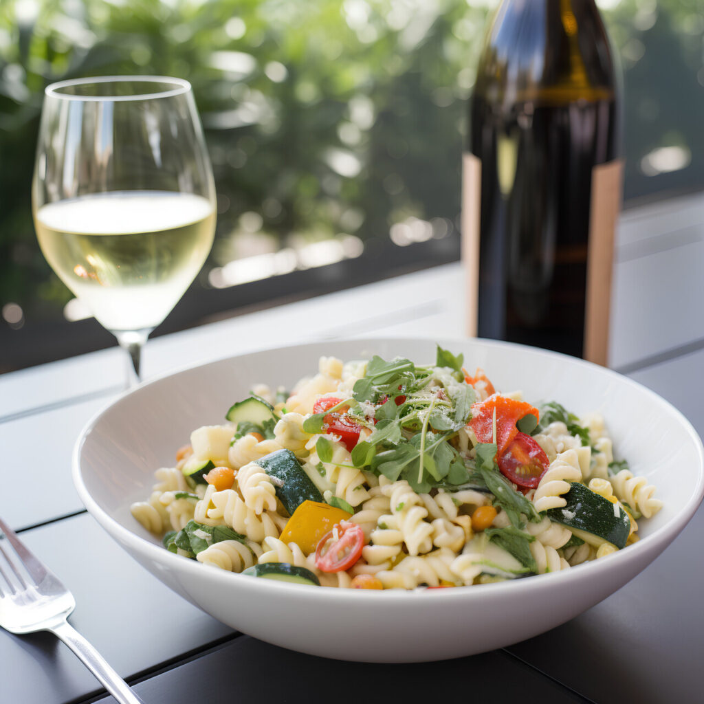
A pasta dish can appear abundant in a photo but feel surprisingly sparse when it arrives, and the difference often comes down to plating rather than portion size. The way it is presented changes how full it seems.
Restaurants commonly use wide bowls that spread pasta across a larger surface. This creates a clean and refined look, but it also reduces the visual density compared to tighter, more compact plating styles.
In photos, pasta is usually centered and styled to look fuller. During real service, sauces spread and noodles settle naturally, revealing more space. The portion is often standard, but the perception shifts once it is plated for actual dining.
5. Milkshakes That Lose Their Drama
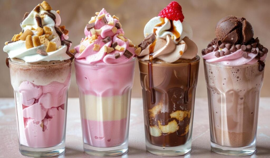
Milkshakes in photos often look like layered desserts, stacked high with toppings and perfectly balanced details. What arrives at the table, however, tends to feel simpler and less structured.
Stylists rely on stabilizers, chilled glasses, and carefully placed toppings to hold everything in place. Some decorative elements are added only for visual effect and are not practical for everyday preparation.
In real service, melting begins almost immediately. Whipped cream softens, toppings shift, and the height reduces quickly. The flavor remains enjoyable, but the dramatic presentation seen in photos is difficult to recreate outside controlled conditions.
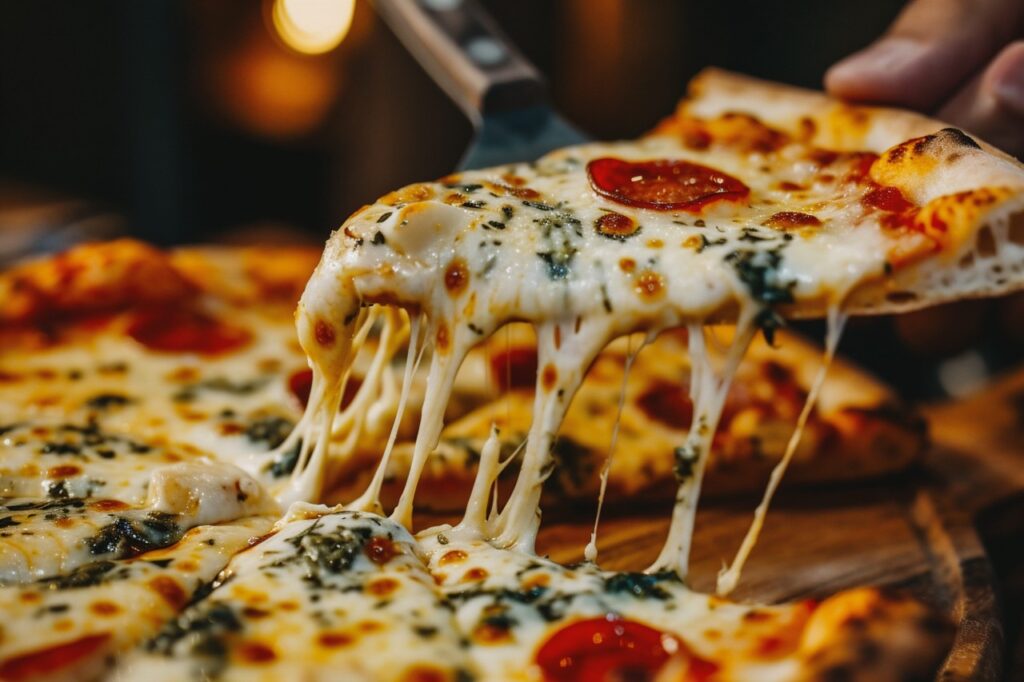
6. Pizza With Perfect Cheese Pulls
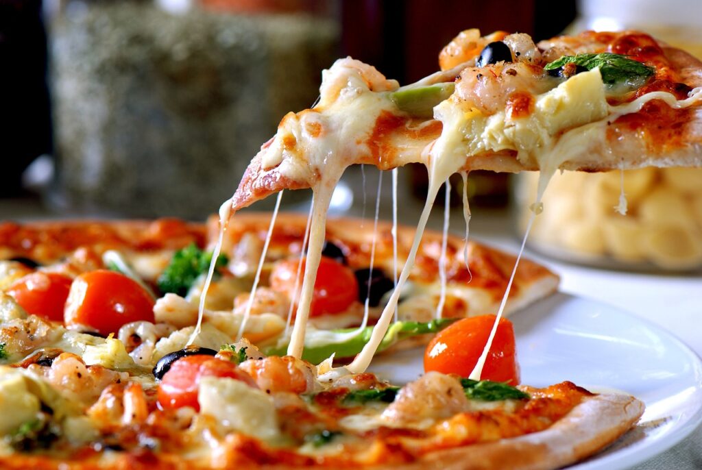
The cheese pull is one of the most iconic food visuals, yet it rarely appears the same way outside of a staged photograph. That perfect stretch is carefully timed and controlled.
In photography, cheese is heated and handled to achieve maximum stretch at just the right moment. Specific blends and techniques are used to enhance elasticity and create a clean, long pull.
In real dining, timing varies, and conditions are less controlled. Cheese cools, breaks, or slides depending on handling and temperature. While a short stretch may happen, the long, flawless pull seen in images is usually a carefully captured moment rather than a consistent reality.
7. Salads That Look Less Vibrant in Person
A salad in a photo is carefully composed to look crisp, bright, and full of contrast, but that visual freshness can fade slightly by the time it reaches the table. The difference is subtle but noticeable.
Food photography relies on strong lighting and selective placement of ingredients. Only the most colorful leaves and vegetables are chosen, then arranged to highlight texture and variation in every visible layer.
In real kitchens, salads are tossed for even coating and may sit briefly before serving. Dressing softens edges and reduces shine, which dulls the overall appearance. The ingredients remain fresh, but the structured, vibrant look is harder to maintain in real service.
8. Sushi Rolls That Aren’t as Precise
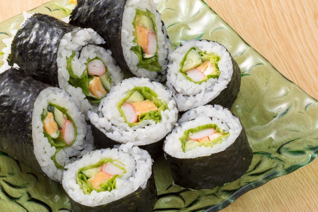
Sushi in photos often looks perfectly uniform, with clean cuts and balanced fillings, but real plates tend to show small variations that reflect how the food is actually made.
Each roll is handcrafted, so slight differences in rice texture, knife pressure, and ingredient placement affect the final shape. Even skilled chefs produce natural variation from piece to piece.
Photographs usually feature the most precise cuts, arranged from the best angle to highlight symmetry. In a working kitchen, consistency is maintained, but exact uniformity is not always possible, making the real version feel less polished than the image.
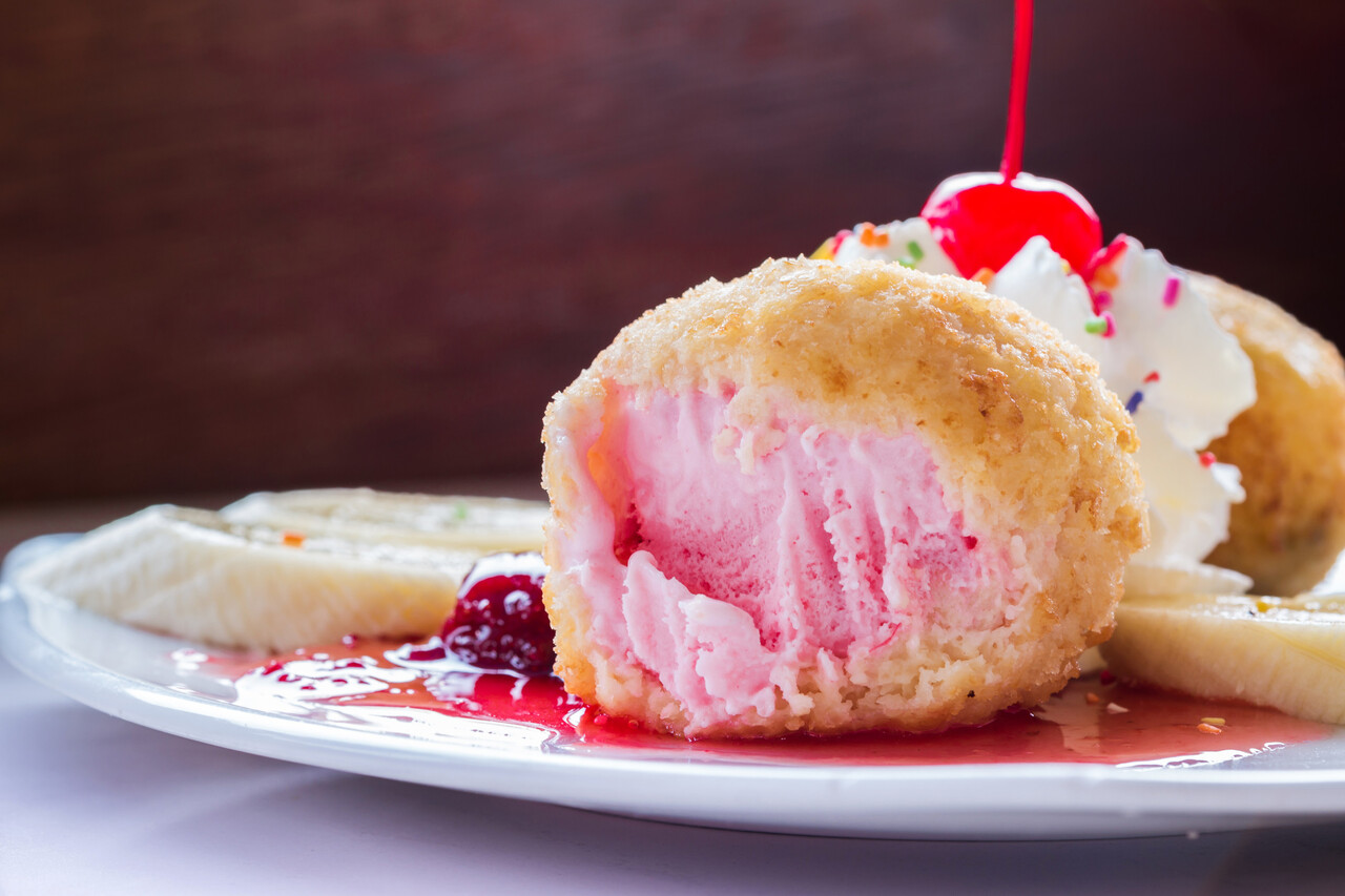
9. Desserts With Missing Details
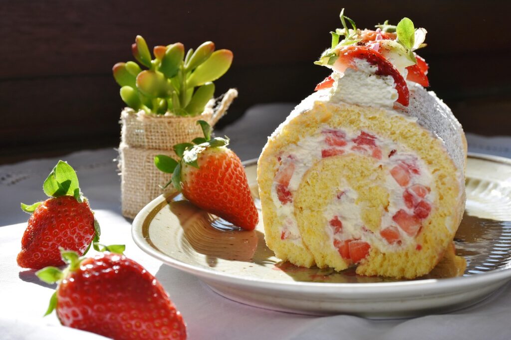
Desserts in menu images often appear intricate and carefully finished, but some of those visual details do not always carry over to what is served at the table.
During styling, garnishes, sauces, and decorative elements are applied with time and precision. Each component is placed to enhance contrast, texture, and overall visual appeal.
In a busy kitchen, speed and consistency take priority. Certain finishing touches may be simplified or skipped to keep service efficient. The dessert itself remains the same, but the extra visual details seen in photos are not always included in every serving.
10. Steak Plates That Look Smaller Than Expected
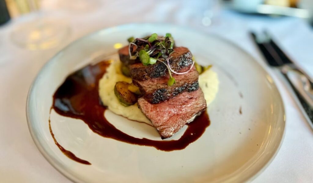
A steak in a menu photo is framed to feel bold and dominant, often giving the impression of a larger portion than what arrives at the table. The difference comes down to how the dish is visually presented.
Food photography uses tight angles, minimal sides, and close framing to keep all attention on the meat. Without surrounding elements for scale, the steak appears more substantial and fills the entire visual space.
In real service, the plate includes sides and more open space, which adds context. This makes the steak look smaller by comparison, even when the weight matches the menu description. The portion is accurate, but perception shifts once the full plate is seen.
11. Breakfast Platters That Seem Less Generous
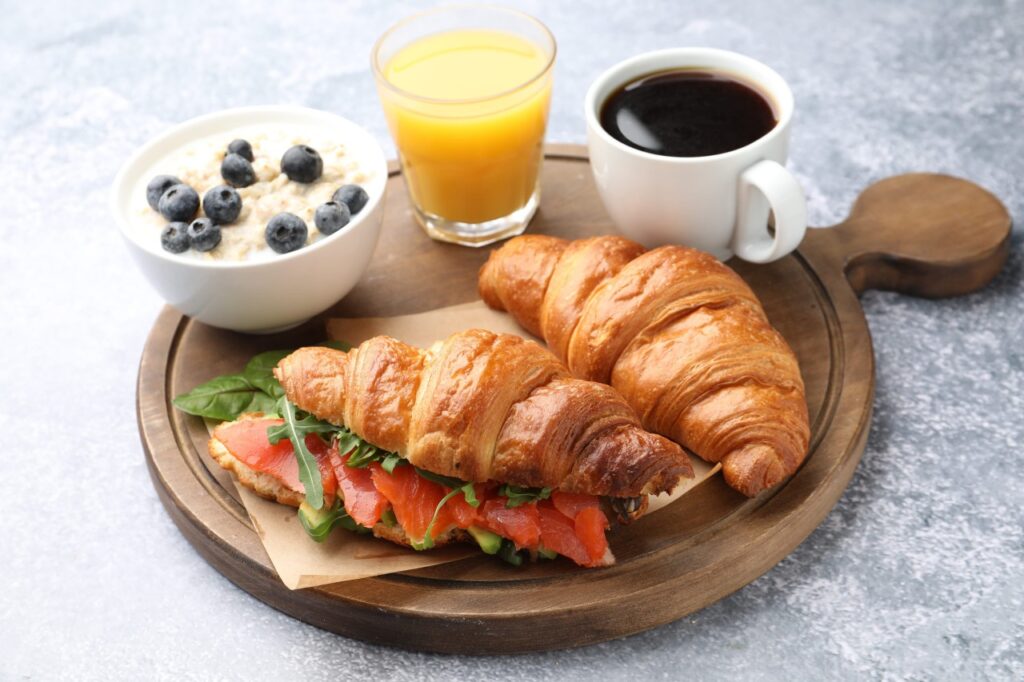
Breakfast platters in photos are designed to look full and abundant, often creating an expectation of a heavily loaded plate. The real version, however, can feel more structured and spaced out.
During photography, items are arranged tightly with slight overlaps to eliminate empty areas. This creates a sense of abundance without actually increasing portion sizes.
In actual service, food is placed with more spacing for practicality and presentation. This makes the plate look cleaner but less crowded. The quantity is usually the same, yet the visual impression of fullness is reduced when everything is neatly arranged.