Your Grocery Store Quietly Rearranged Itself in 2026: 9 Changes Not Made for Your Convenience
A grocery store may look familiar on the surface, but subtle changes have been quietly reshaping how shopping works in ways that often go unnoticed. From shifting layouts to strategic product placement, these adjustments are rarely made with convenience as the main priority. Instead, they are carefully designed to influence movement, attention, and buying decisions through small but effective techniques. What feels like a normal shopping experience is often the result of constant testing and refinement, revealing how deeply strategy is built into everyday routines.
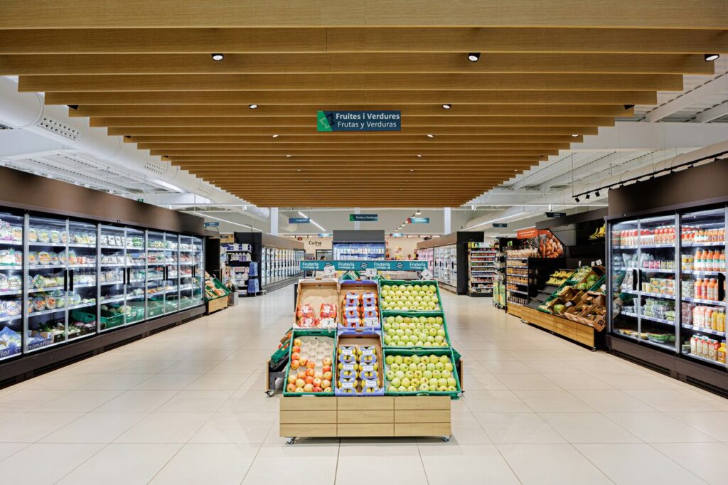
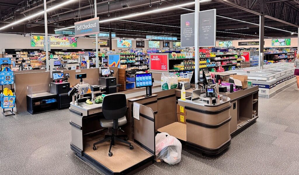
1. Layouts keep changing
A familiar store suddenly feeling unfamiliar is rarely accidental, and frequent layout changes are one of the most deliberate strategies used in modern grocery design. What seems like a simple reshuffle is often a calculated move to interrupt routine.
When shoppers know exactly where items are, they tend to move quickly and buy only what they need. By rearranging aisles or relocating products, stores encourage slower movement and increased exposure to more items along the way.
This disruption leads to more browsing and higher chances of unplanned purchases. It may feel inconvenient, but it serves a clear purpose tied to increasing overall sales. These adjustments are often tested and refined based on results.
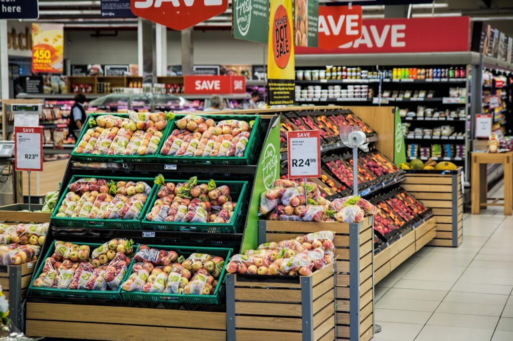
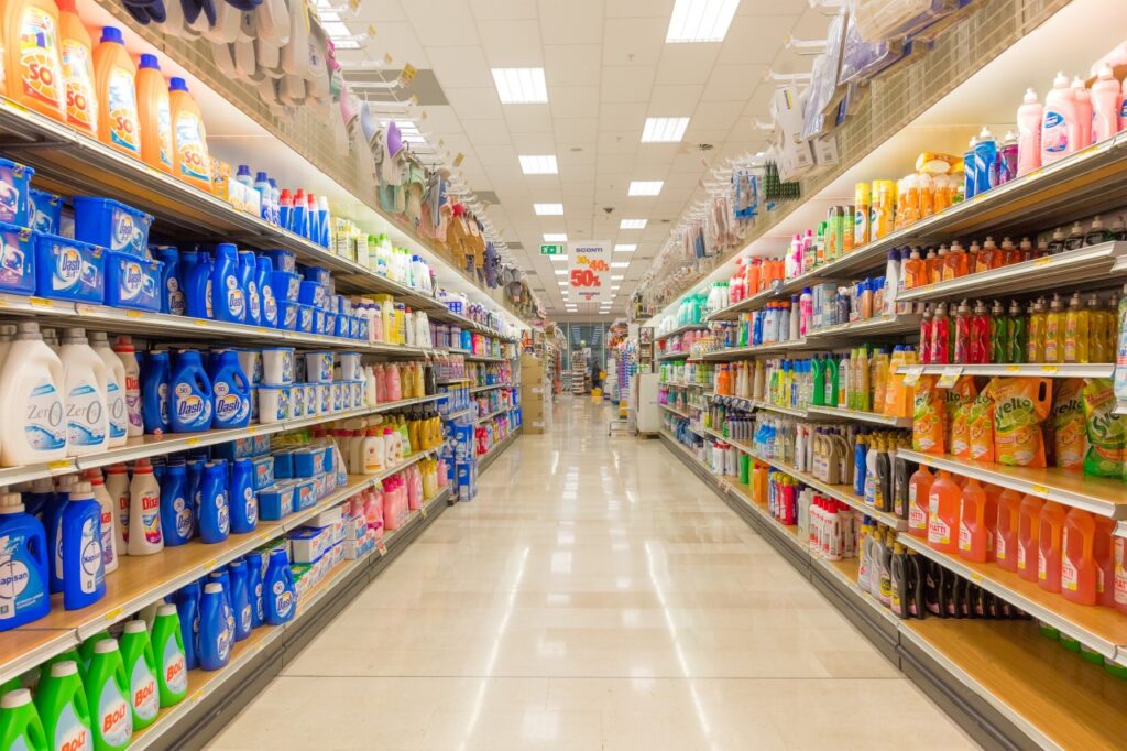
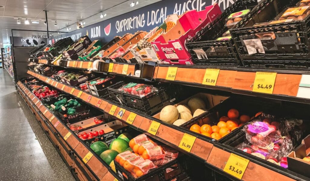
2. Eye-level means higher profit

The most visible shelf space in any aisle is rarely given to random products, and eye-level placement is one of the most valuable positions in a store. Products placed here are often those that generate the highest margins. Visibility directly translates into higher selection rates. This makes these spots highly competitive.
Brands may pay for this positioning, or stores may prioritize their own private label items to maximize profit. As a result, the most noticeable options are not always the best value for the shopper.
Lower or higher shelves often hold more affordable or less promoted alternatives. A small shift in attention can reveal options that are easily overlooked. Careful browsing can lead to better purchasing decisions.
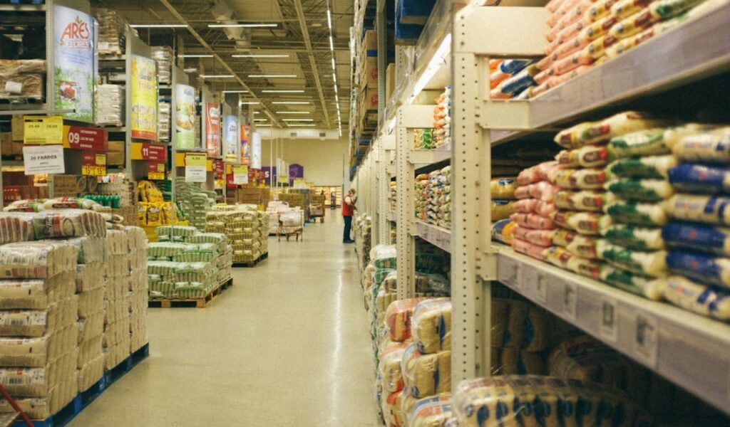
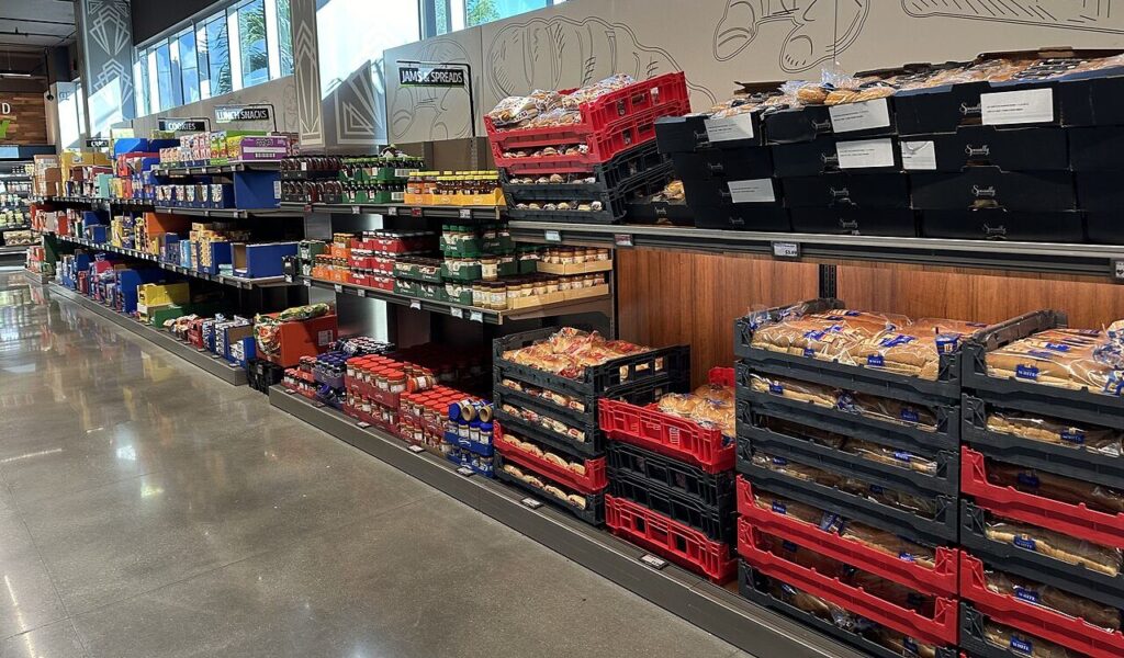
3. Essentials are spread out
Basic items like milk, eggs, and bread are rarely placed near each other, even though they are often bought together. This separation is intentional and designed to increase the distance covered during a shopping trip. It ensures movement across multiple sections of the store.
By placing these essentials in different corners of the store, shoppers are guided through multiple aisles, increasing exposure to a wider range of products. Each additional step creates another opportunity for impulse decisions.
This layout turns a quick visit into a longer one without being obvious. What feels like a normal path is carefully designed to extend the time spent inside the store. Even small detours can influence final purchases.
4. End caps drive impulse buys
The displays at the ends of aisles often stand out with bright packaging or special signage, drawing attention even before entering the aisle. These end caps are among the most effective tools for influencing quick decisions.
Products placed here are typically chosen for visibility and sales potential rather than necessity. Limited-time offers, or seasonal items, are often featured to create a sense of urgency.
Because they are encountered repeatedly while moving through the store, they increase the likelihood of unplanned purchases. Their placement ensures they are difficult to ignore. Repetition strengthens their impact on choices. Familiarity builds a sense of trust in these products.
5. Checkout zones trigger last-minute buys
The area near the checkout is designed to capture attention during the final moments of a shopping trip. Small items placed here are chosen for quick decisions and easy additions to the cart. This placement takes advantage of waiting time. It turns idle moments into buying opportunities.
These products are usually low-cost and require little thought, making them ideal for impulse buying while waiting in line. The timing of this exposure plays a key role in its effectiveness. Convenience makes them easy to justify.
By the time shoppers reach this point, most decisions feel complete, which makes these last-minute additions feel harmless. This subtle strategy consistently increases overall spending. Even small additions can add up quickly.
6. Shelf space is bought
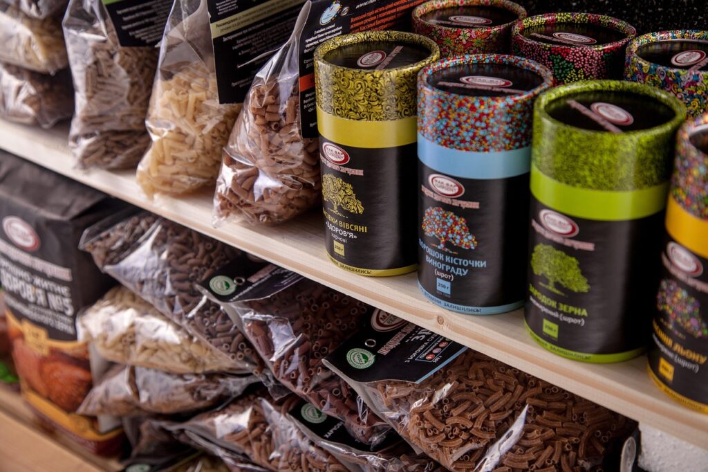
Not all products earn their position on the shelf through quality or popularity, and shelf placement is often influenced by financial agreements between brands and retailers. This practice shapes what shoppers see first.
Brands may pay for better positioning, ensuring their products are placed in high-visibility areas where they are more likely to be chosen. This creates an uneven playing field for smaller or lesser-known brands. It affects competition within the store.
Understanding this dynamic helps explain why certain products dominate attention. Visibility is often a result of strategy rather than pure demand. Awareness can lead to more informed choices. It encourages looking beyond familiar options.
7. Store design guides behavior
Every element of a grocery store, from aisle width to lighting, is designed with behavioral patterns in mind. The goal is to create a flow that feels natural while subtly influencing movement. Design choices are rarely accidental.
Wide entrances, carefully placed signage, and product arrangement all work together to guide shoppers through a specific path. These elements are based on studies of how people navigate spaces. Shoppers are guided without realizing it.
This design approach makes the experience feel intuitive while shaping decisions in the background. It turns the store into a controlled environment that encourages spending. The influence often goes unnoticed. Subtle cues drive consistent behavior.
8. Products are grouped to encourage more buying
Items that are commonly used together are often placed close to each other, creating a sense of convenience while encouraging additional purchases. This grouping makes it easier to imagine complete meals or combinations.
For example, placing pasta near sauces or chips near dips increases the likelihood of buying both. These associations are built around common habits and preferences. They rely on familiar usage patterns. This makes the pairing feel natural.
This arrangement simplifies decision-making while increasing the number of items in a cart. It is a subtle way of expanding purchases without direct promotion. The effect is both practical and strategic. It quietly increases overall basket size.
9. Changes are driven by data
Modern grocery stores rely heavily on data to make decisions about layout, placement, and product selection. Every change is informed by patterns in customer behavior and sales performance. Data shapes nearly every adjustment.
Technology tracks what sells, where it sells best, and how shoppers move through the store. This information is used to continuously refine the shopping environment for maximum efficiency. Insights are constantly updated.
As a result, changes are rarely made for convenience alone. They are designed to align with measurable outcomes, often prioritizing store performance over ease of navigation. The focus remains on optimizing results. This approach ensures consistent improvement in sales.