8 Grocery Brands That Sell Mainly Because of Nostalgic Packaging
Walk down any grocery aisle, and you’ll notice something interesting. Some products don’t really compete on innovation, ingredients, or even price. They compete on memory. These are the brands that feel familiar before you even read the label, the ones that look almost exactly the way they did decades ago. Their packaging isn’t just a container. It’s a trigger. Bright gelatin boxes, classic soup cans, old-school cereal mascots, and ketchup labels that haven’t budged much over time all tap into something deeper than convenience. In a market obsessed with reinvention, these brands prove that nostalgia can still be one of the strongest sales tools around.
1. Jell‑O
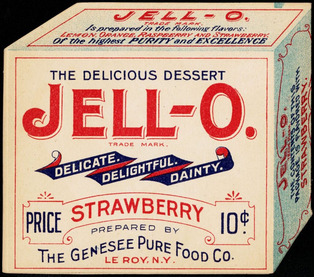
Here’s the thing about Jell-O. Very few people buy it because they urgently need gelatin in their lives. They buy it because the box itself feels like a time capsule. The bold colors, the slightly retro typeface, the unchanged promise of wobble and shine all pull from decades of family dinners, school lunches, and holiday salads that made no logical sense but somehow worked. What keeps Jell-O relevant isn’t innovation so much as restraint. The brand has resisted modern minimalism and health-halo redesigns, keeping packaging that signals comfort and familiarity. That matters because gelatin desserts today compete with yogurt cups, protein snacks, and refrigerated treats that are objectively more convenient. Jell-O survives because shoppers recognize it instantly, trust what it will taste like, and associate it with low-stakes joy. The packaging does the emotional work before the product ever reaches a bowl, reminding buyers that this is something they’ve known their whole lives.
2. Pepsi
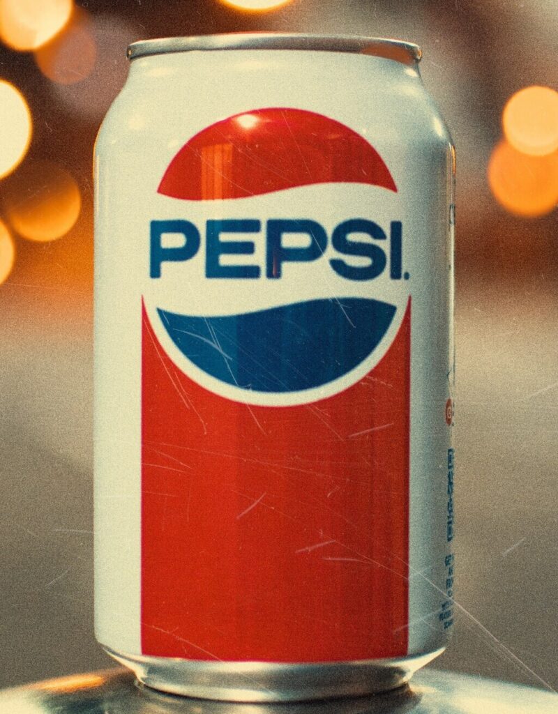
Pepsi’s modern branding changes constantly, but its retro packaging is where the emotional gravity lives. When classic logos and throwback cans appear, sales spikes are rarely about flavor differences. They’re about memory. The older fonts, flat color blocks, and vintage layouts instantly call back to earlier decades of pop culture, road trips, and shared sodas at parties. What makes Pepsi’s nostalgia strategy effective is that it feels intentional rather than accidental. The brand uses its archive as a tool, reintroducing designs that signal fun, rebellion, and youth from earlier eras. Even younger shoppers who never lived through those decades respond to the authenticity of a design that predates algorithm-driven branding. The packaging communicates that this is a drink with history, not just another carbonated option. In crowded beverage aisles, familiarity still cuts through faster than novelty.
3. Campbell’s
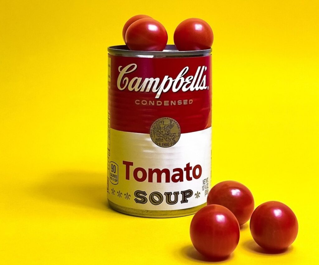
Campbell’s soup is one of the clearest examples of packaging becoming inseparable from the product itself. The red-and-white label is so iconic that it barely needs a logo anymore. It signals warmth, reliability, and the idea that dinner can be solved with very little effort. While competitors experiment with fonts, color gradients, and lifestyle photography, Campbell’s largely stays put. That consistency reassures shoppers who want predictability, especially during colder months or stressful weeks. The packaging also carries cultural weight, reinforced by decades of advertising and even fine art references. You don’t pick up a can of Campbell’s expecting culinary surprise. You pick it up because you know exactly what you’re getting, and the label confirms that promise instantly. The brand’s endurance shows how powerful visual familiarity can be when a product’s role in daily life is comfort rather than excitement.
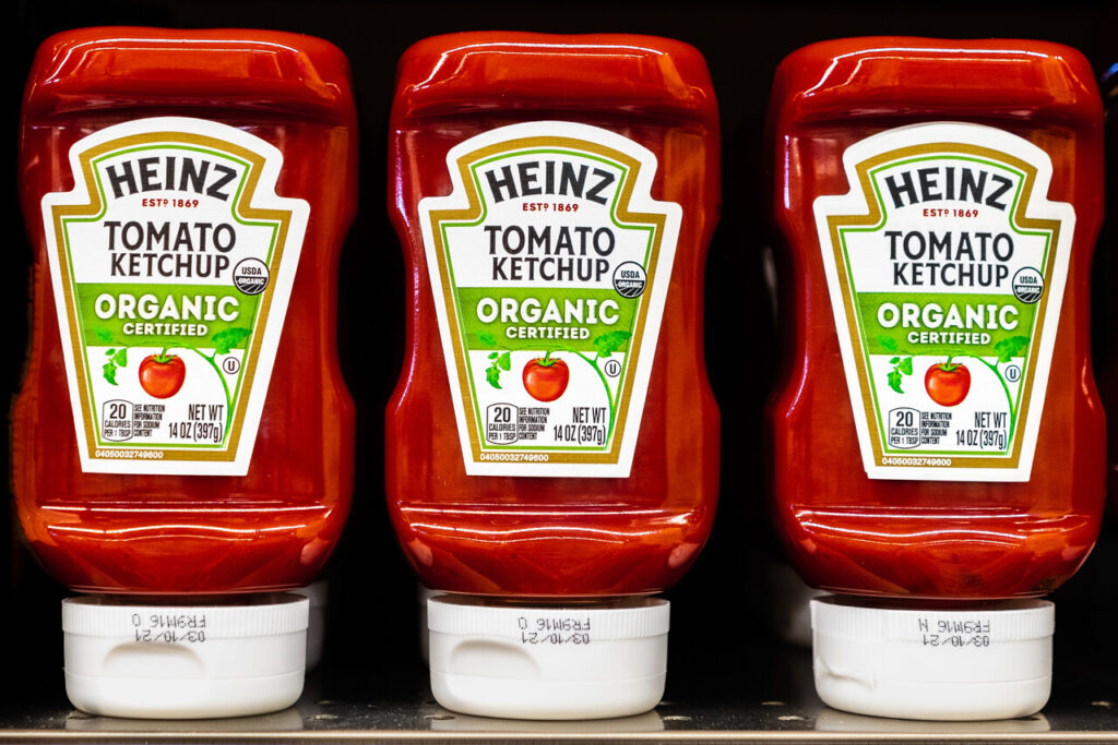
4. Heinz
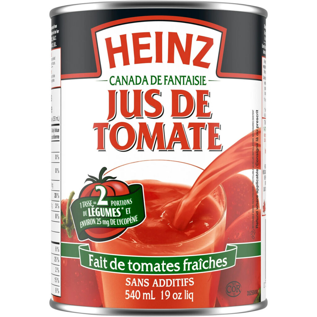
Heinz ketchup proves that even subtle packaging can become deeply nostalgic. The glass bottle shape, the keystone label, and the restrained color palette have changed so little that they function as a trust signal. Heinz doesn’t need to shout on shelves because its look already carries authority. For many shoppers, it represents the default ketchup, the one they grew up with at cookouts and diners. That emotional baseline matters in a category crowded with organic, flavored, and store-brand options. Heinz’s packaging reinforces the idea that this is the standard against which others are judged. Even plastic squeeze bottles maintain visual cues from earlier designs, preserving continuity across generations. The result is a brand that sells not through reinvention, but through the quiet confidence of familiarity.
5. Hershey’s
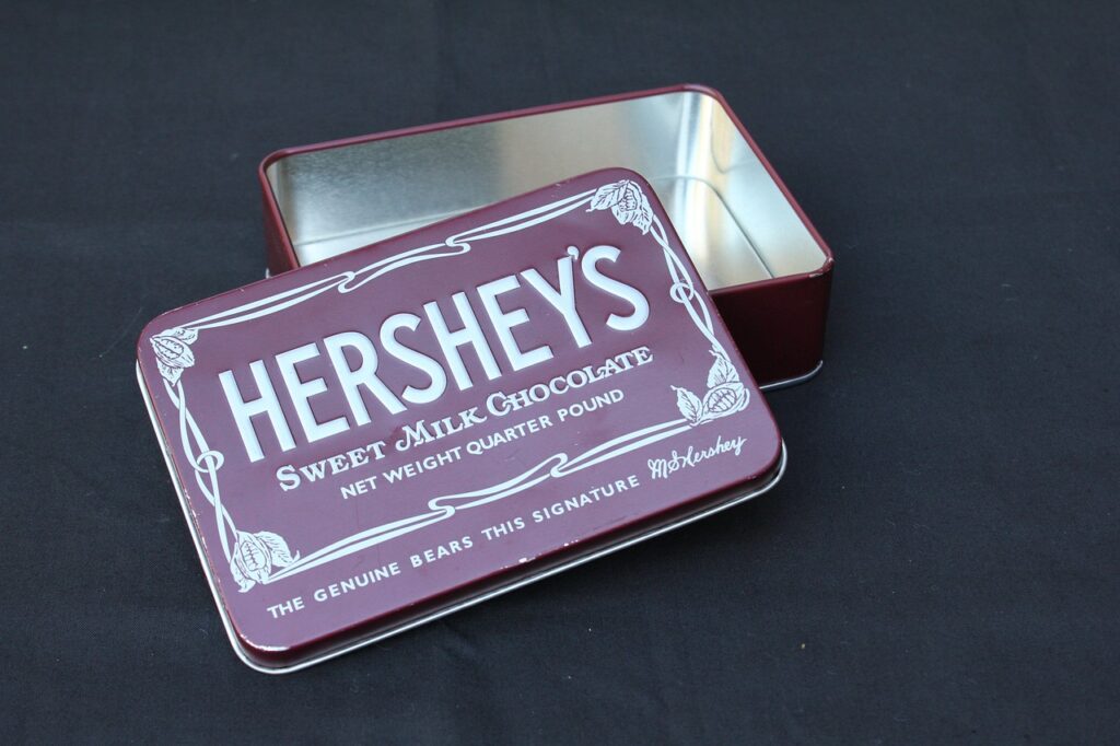
Hershey’s chocolate bars lean heavily on visual memory. The simple brown wrapper, bold lettering, and lack of decorative excess make the product feel unchanged by time. That’s intentional. Hershey’s doesn’t compete on luxury or trendiness. It competes on recognition and emotional access. The packaging suggests something straightforward and dependable, which aligns with how the chocolate tastes and how people use it. It’s the bar you grab for s’mores, baking, or a quick treat without overthinking. While premium chocolates rely on storytelling and exotic ingredients, Hershey’s relies on shared experience. The wrapper looks the same in childhood hands and adult ones, reinforcing the idea that some comforts don’t need upgrading. That consistency keeps the brand relevant even as tastes diversify.
6. Kellogg’s Corn Flakes
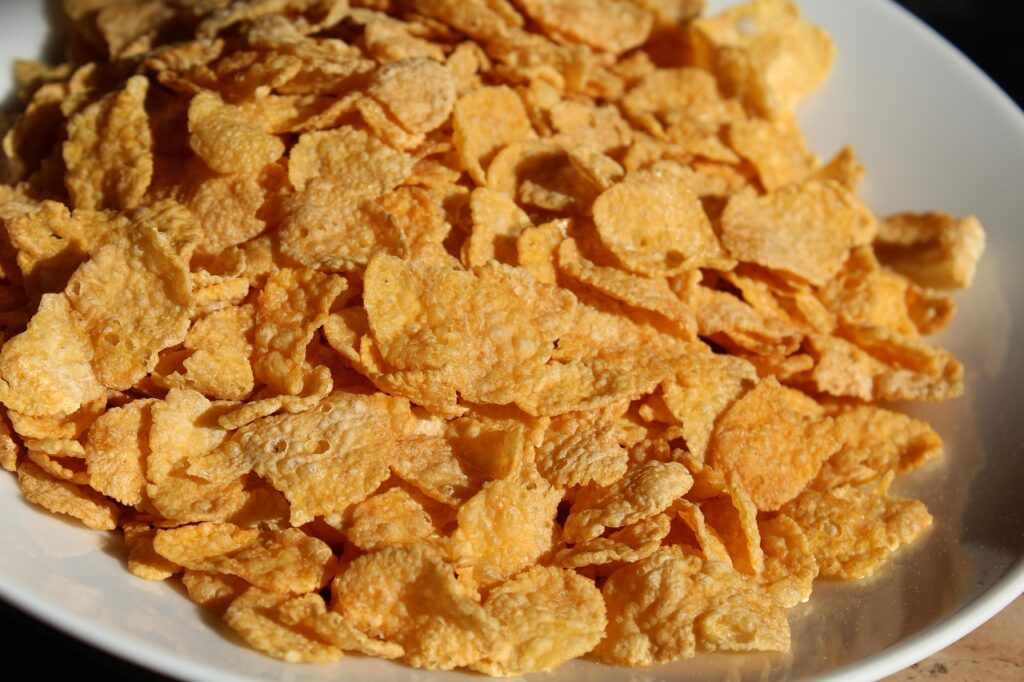
Corn Flakes packaging succeeds because it anchors itself in tradition without feeling outdated. The rooster, the familiar red script, and the clean layout immediately place the product in the morning routines of past decades. Even as cereal consumption changes, the box still signals simplicity and structure. Parents recognize it as something they ate growing up, while children associate it with stability rather than novelty. That matters in a category flooded with hyper-colorful, character-driven options. Kellogg’s hasn’t chased trends aggressively here, choosing instead to preserve visual continuity. The packaging reinforces the idea that breakfast can be calm, predictable, and uncomplicated. That emotional reassurance is often more persuasive than nutritional claims or flashy redesigns.
7. Betty Crocker
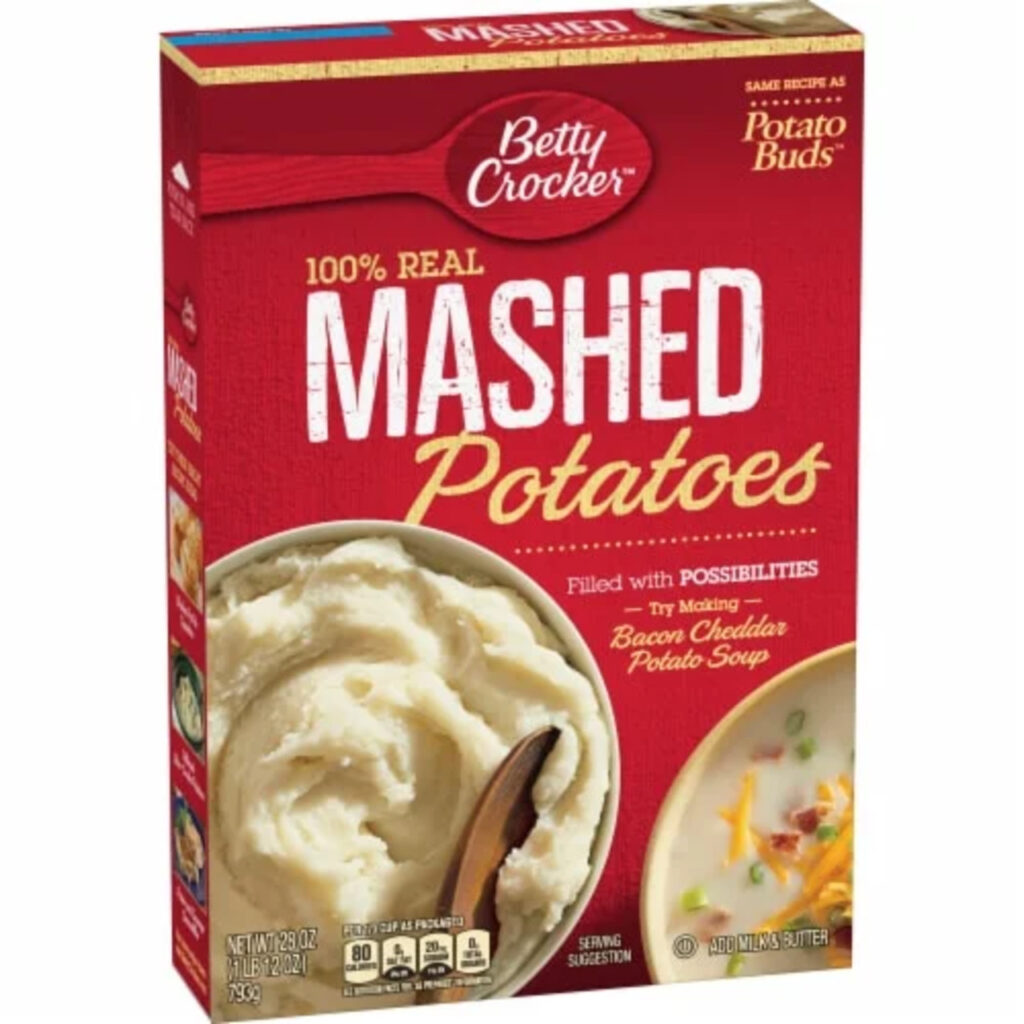
Betty Crocker’s packaging trades almost entirely on heritage. The red spoon logo and classic layout evoke home kitchens, handwritten recipes, and family baking traditions. Even for shoppers who know the brand is a corporate creation, the imagery still carries authority. It suggests guidance and reliability, especially for people who don’t bake often. The packaging doesn’t promise innovation. It promises that the cake will turn out fine. That reassurance is powerful. In an era of complex recipes and social-media baking pressure, Betty Crocker feels approachable. The brand’s visual consistency allows it to function as a shortcut for confidence. Buyers trust it not because it’s new, but because it looks like something that’s worked for generations.
8. Borden Dairy
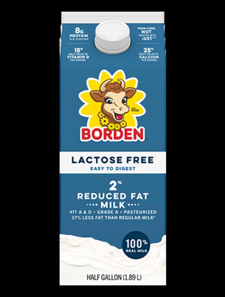
Borden’s use of Elsie the Cow taps directly into early brand storytelling, when mascots were designed to feel friendly and human. The imagery recalls mid-century advertising that emphasized wholesomeness and trust. Even as dairy consumption shifts and competition intensifies, the packaging still communicates familiarity. Shoppers may not articulate it, but they recognize the character and associate it with childhood milk cartons and simple routines. That recognition can outweigh price differences or newer branding from competitors. Borden’s packaging doesn’t try to look modern or edgy. It leans into its past, signaling that this is a brand that’s been around long enough to be dependable. In a category where trust matters, nostalgia does a lot of heavy lifting.