Why Every Can of Campbell’s Soup Has a Medal Printed on It
The Campbell’s soup can is one of the most recognizable packages in American history, but few people realize that the tiny gold medal printed on every label carries a story more than a century old. This small emblem isn’t just a decorative flourish; it represents a moment of international recognition that helped shape the brand’s identity and earned consumer trust long before modern advertising existed. It also shows why Campbell’s has proudly preserved this detail through every redesign, allowing a historic achievement to continue speaking to shoppers at a single glance.
Why Campbell’s Soup Gold Medal Still Defines Its Iconic Can
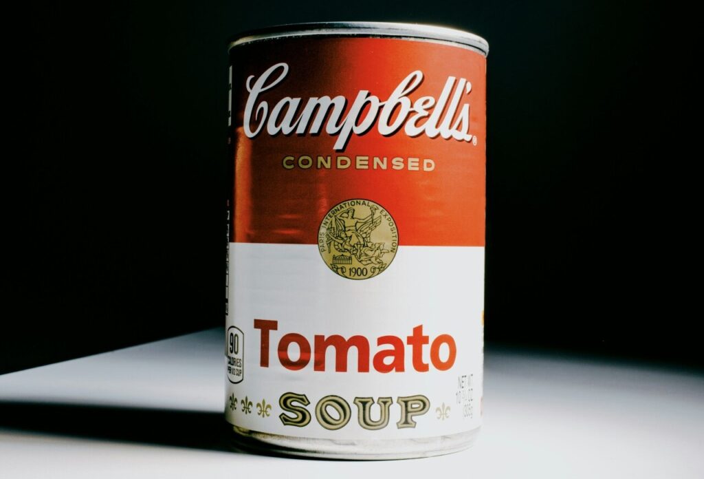
The small gold medal on every Campbell’s can is more than decoration; it is a visual shortcut that signals a century of brand storytelling. That tiny emblem sits in the top-left quadrant of the label and quietly communicates legacy, quality, and continuity. For shoppers scanning crowded grocery shelves, the medal helps the can read as familiar and trustworthy before the eye even lands on the product name. Over time, the medal became part of the overall visual shorthand that makes the Campbell’s instantly recognizable. Because packaging is where first impressions happen, the medal’s persistence shows how even minor marks can carry outsized meaning when reinforced across generations.
From Canning Beginnings to Distinctive Packaging
Campbell’s began in the mid-19th century as a preserves and condensed soup innovator at a time when canned goods were gaining consumer trust. Early cans were utilitarian, but as mass production and retailing matured, packaging shifted from simple tins to designed labels that communicated safety and value. The company embraced label printing as a marketing tool, moving beyond basic product names to crafted visuals that would stand out on store shelves. The brand’s evolving packaging choices reflected both advances in printing technology and a new understanding that design could shape consumer perception. The medal was folded into that system as a mark of distinction within a fast-growing market.
The Paris Exposition Award That Changed Everything
Winning recognition at international exhibitions was a powerful credibility booster for brands in the 19th and early 20th centuries. A high-profile award at a fair such as the Paris Exposition conferred prestige that translated into consumer confidence back home. When Campbell’s received honors at such events, the company adopted the medal as a visible claim to excellence, a shorthand for an external validation few rivals could match. The medal carried the weight of that public recognition into everyday shopping. In an era before modern food regulation and standardized testing, such badges served an important role in reassuring buyers about quality and consistency.
What the Medal Represents: Quality, Heritage, and Brand Assurance
The medal is a layered symbol. At one level it signals a historic award and product excellence. At another, it embodies continuity. Campbell’s has used the mark through generations, making it a heritage cue. For many consumers, the medal is as much a promise of the brand’s history as it is a low-cost certification of quality. Importantly, the medal also functions as a trust signal in markets where shoppers make quick choices. Even when the technical meaning of a medal becomes vague, its psychological effect persists: badges imply vetting and standards. That enduring trust value is why brands maintain such emblems even as product formulas and packaging technologies change.
How Design Choices Made the Medal Enduring
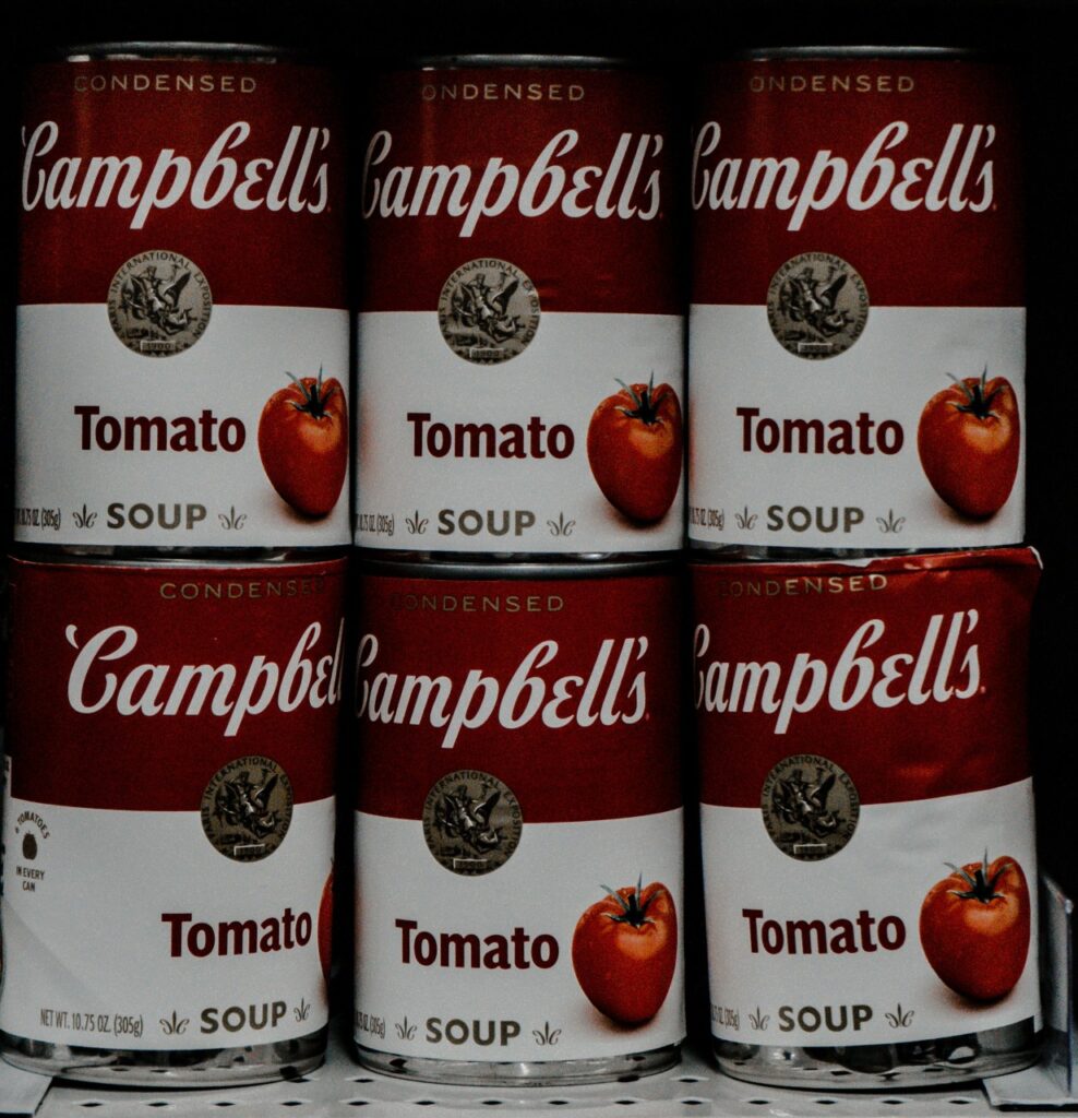
The medal endured because it fit neatly into a larger, disciplined visual system. Campbell’s label relies on simple geometry, bold color blocking, and legible type elements that work together to create an iconic silhouette. The gold circle is small but placed deliberately where it balances the composition and draws the eye without overwhelming other information. Because the company prioritized consistency, small elements like the medal were protected during periodic redesigns. Rather than replacing the symbol, designers refined its rendering, ensuring it remained contemporary while preserving recognition.
The Medal’s Role in Campbell’s Cultural and Visual Legacy
Beyond packaging, the medal became part of Campbell’s cultural footprint. The label has been copied, parodied, and celebrated in art and advertising, and the medal participates in that visual vocabulary. It appears in nostalgia-driven marketing, limited editions, and archival imagery, reinforcing the idea that the brand is woven into social memory. The emblem also helped Campbell’s become an object of design discourse, an example of how simple graphics can become cultural icons. Museums, designers, and advertisers point to the Campbell’s can and its medal when discussing effective branding. The mark’s presence elevates the can from commodity to cultural artifact in the public imagination.
Recent Updates: Modern Redesign While Honoring Tradition

Recent packaging updates show how the medal can be refreshed without breaking continuity. Modern refinements have brightened the medal, adjusted type weights, and simplified surrounding elements to fit contemporary retail contexts like online thumbnails and high-contrast shelving. The redesigns demonstrate sensitivity to digital and physical display while keeping heritage cues intact. These changes are deliberate: maintain recognition, improve legibility, and meet production demands. The updated medal still signals the same core messages: quality, history, and reliability, but in a version calibrated for today’s visual language. That careful balance explains why the medal persists as an effective and beloved part of the Campbell’s identity.
Reference
- Why Every Can Of Campbell’s Soup Is Printed With A Medal – thetakeout.com
- Campbell’s Soup Can: From Grocery Shelf to Art Icon – spice.alibaba.com